PROJECT: MESSAGING WIDGET
ROLE: UX/UI DESIGNER
CHALLENGE
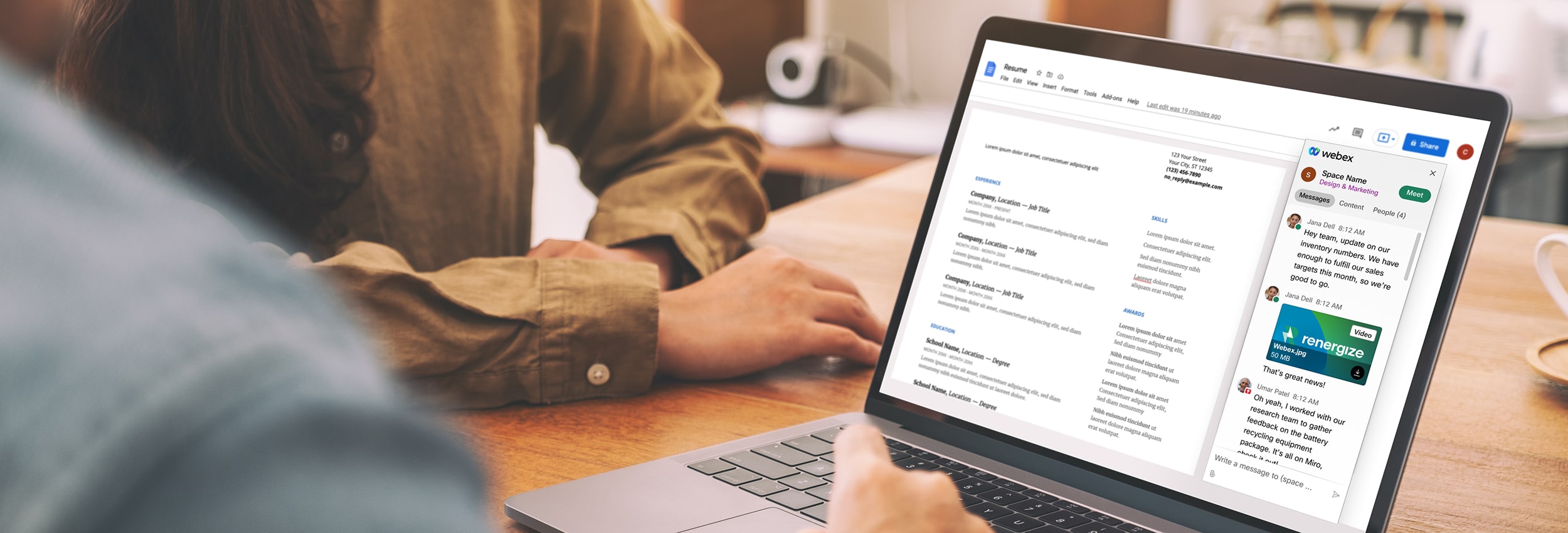
Webex widgets represent a single product feature of the Webex client that can be integrated into other apps. Webex Messaging widget was built on Google Workspace, allowing users to access their Webex account right in Google. Webex was currently going through a full-on redesign of their brand and product. The scope of this project was to redesign their messaging widget so that it’s consistent with their new brand and identify any UX/UI issues that can be improved.
RESULTS
I partnered with the UX Design lead on this project, focusing on visual and interaction design efforts. The redesign of the Webex Messaging widget allows for a more seamless experience across the newly rebranded Webex. With the main UX/UI issues being resolved, it allows for a more usable and intuitive experience. The redesign also makes it more scalable for future Webex integrations that utilizes widgets, such as Jira or Zendesk, to use the same design for a more consistent experience across all apps.
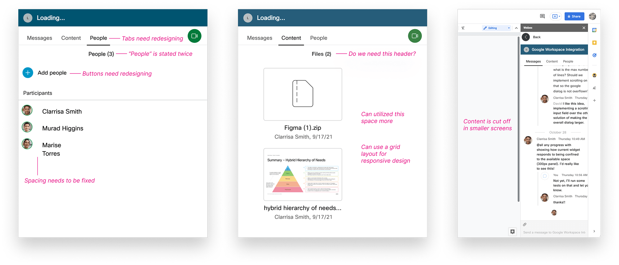
While evaluating the design and interactions in the current widget and comparing it to the Webex client, we identified some key issues:
In identifying the major issues of the current widget and evaluating the business goals for the redesign, it helped us frame the objective of this project:
How might we redesign the Webex Messaging widget to create a seamless Webex experience in Google Workspace?
While digging deep into the nuances of the current rebranded Webex client, including visual design and layout, explorations and interpretations were made in how to translate that into a widget design with a smaller size that would be responsive.
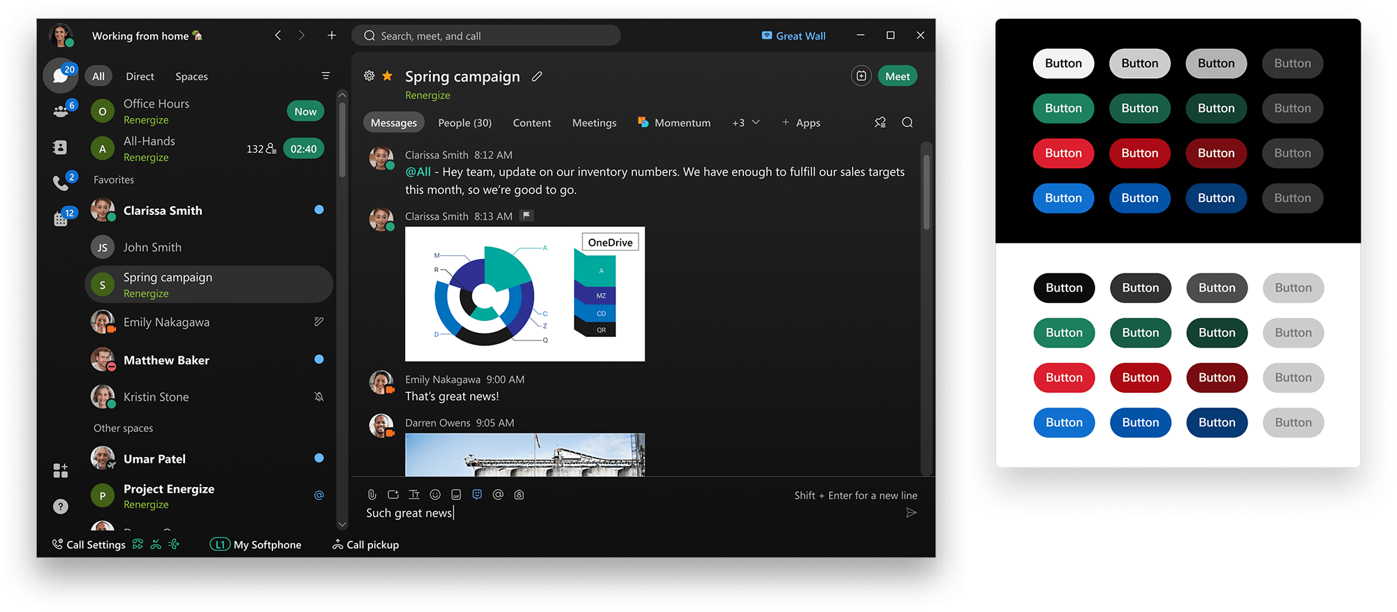
For the rebrand, the design system went through a major redesign. We wanted to utilize the new component library as much as we could in the new widget design. This included updating the overall visual design, colors and component interactions.
The challenge was that the design system was constantly being updated and there were no previous components being built for engineers to work off of. Therefore there was constant communication between the design system team to make sure we were on brand, and communication with engineers on component interactions and any constraints for this project.
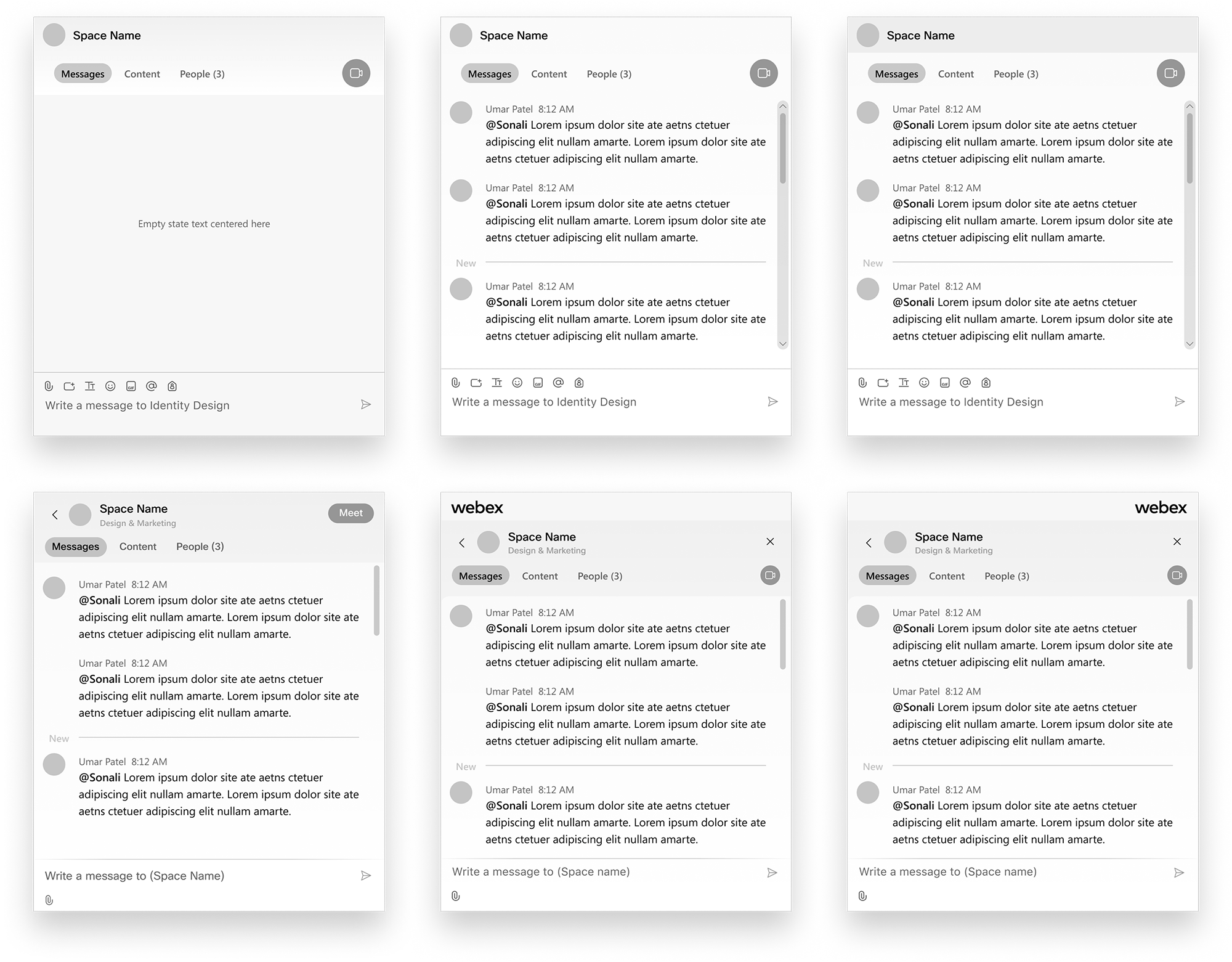
For this widget, our MVP consisted of a messaging tab for a specific space, content tab where all shared content from that space can be viewed, and people tab where users can add people into the space. After getting feedback from our design system team, a final design template was decided, which included subtle gradients and curved shapes that suited the Webex brand. The layout, placement of UI components and spacing were similar to the client but adjusted for the widget.
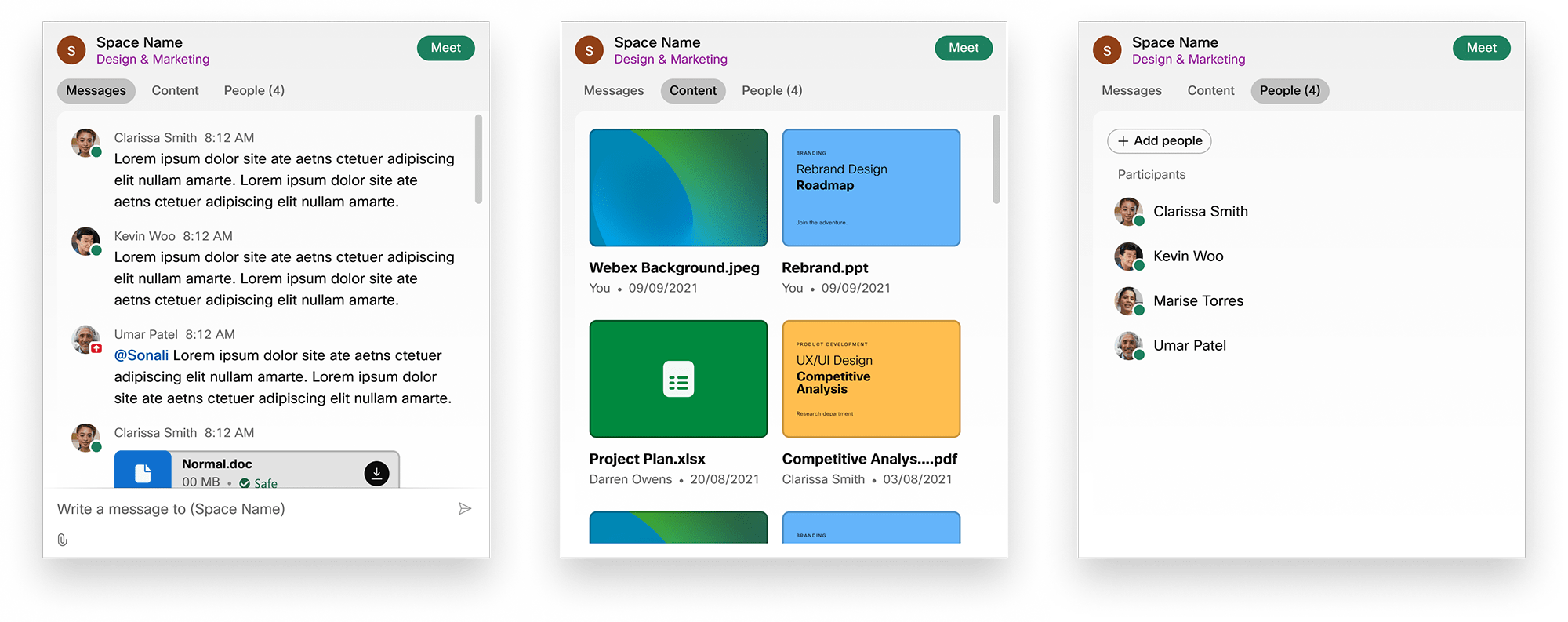
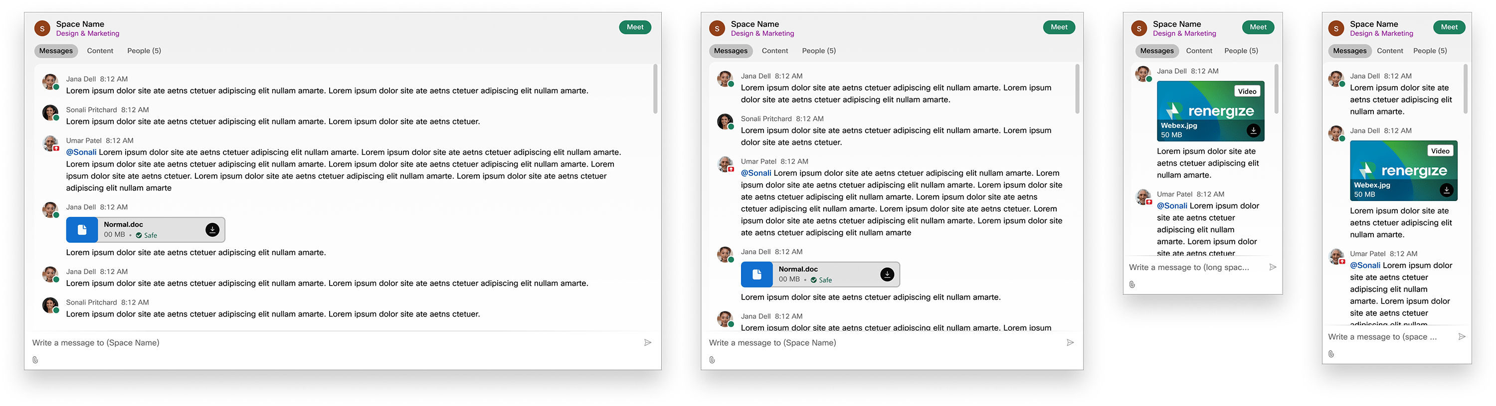
To provide a seamless experience across Webex, we dug into the details of the interaction design, constantly referencing the rebranded Webex client and utilizing the current design system for consistency. Some of the main interactions that needed to be worked on were how users interact with messages, i.e. sending a file or flag/deleting messages, and how users might add a person to the space.
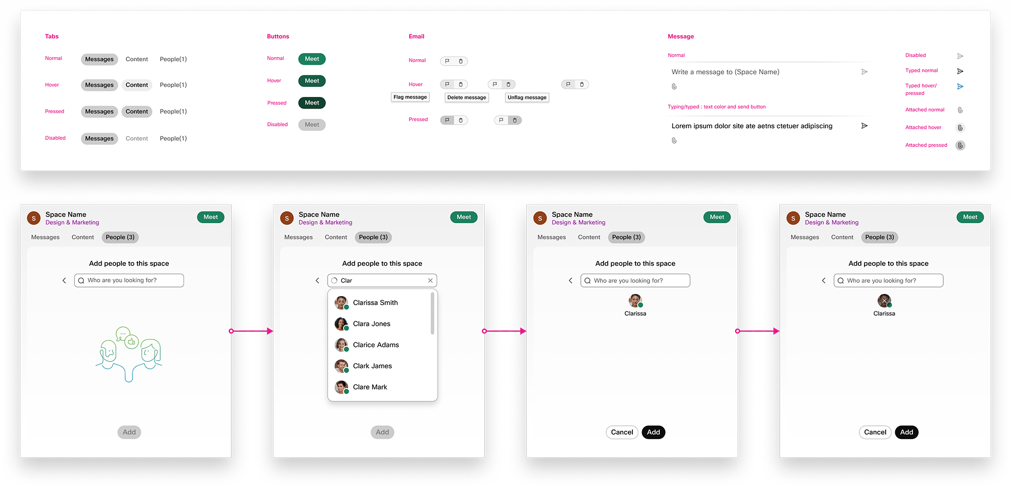
At first, fixing responsive issues was not part of the scope. However, this issue severely compromised the user experience of the product. The UX Design lead escalated this issue and fixing these issues was added to the MVP. We made sure the messages properly wrapped according to the screen size and adjusted spacing and layout for smaller screens.
Working on this project deepened my understanding on the intricacies of interaction design and the importance of a design system to create a consistent product experience. In working with a UX Design lead that had a good understanding of how to advocate for users, it also helped me learn how to navigate through project constraints while providing the best possible user experience.
Webex’s promise to users was “no app switching necessary.” But there were a few features that were not included in the MVP, for example replying to a specific message thread. Next steps would be to hash out these features so that the widget would be a stand-alone product and increase product adoption.