PROJECT: PRODUCT FEATURE
ROLE: UX/UI DESIGNER
CHALLENGE
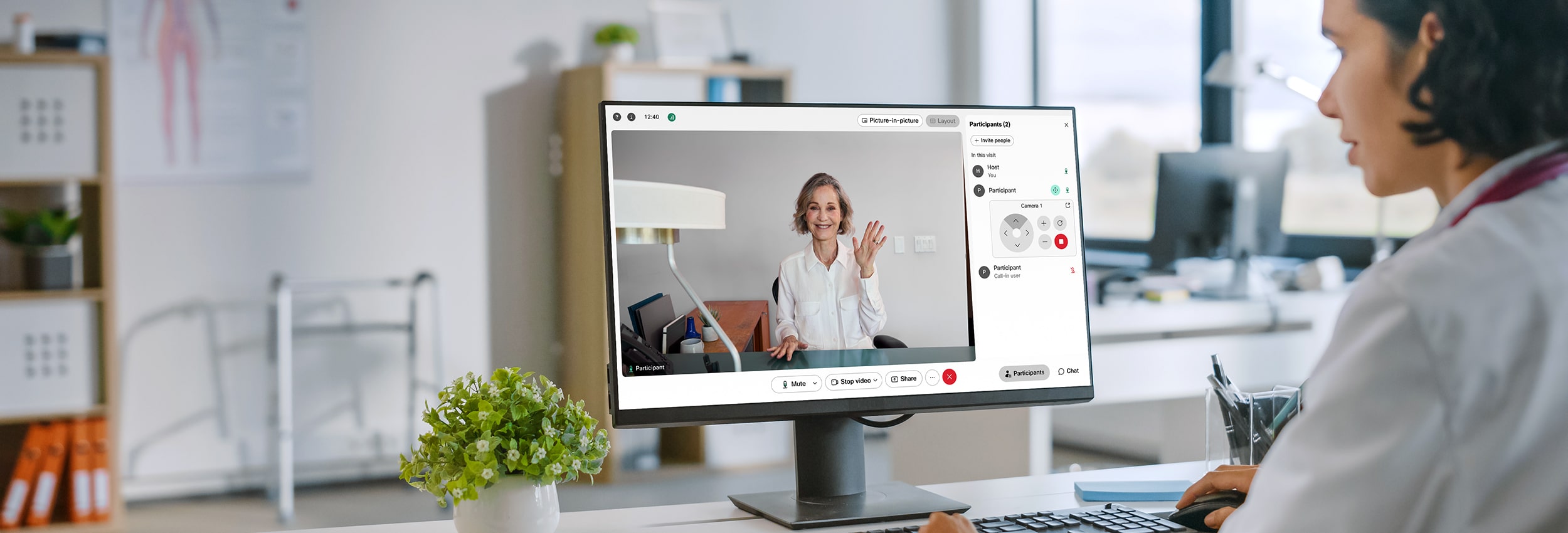
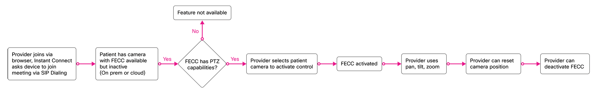
Webex Instant Connect is a browser-based meeting platform that allows healthcare staff and patients to meet for video telehealth consultations. Previously, it was difficult for providers to assess their patients remotely. They would either have to see their patients in person or have an on-site staff member move the patient’s camera to focus on a particular problem area. The project was to design a feature in Instant Connect that would allow a provider to control a patient’s camera remotely to further assess and give a diagnosis.
RESULTS
The new feature allows providers to see which cameras can be controlled and control a camera through pan, tilt and zoom functions. Despite several constraints that were surfaced throughout the project, I navigated around them to find the best solution.

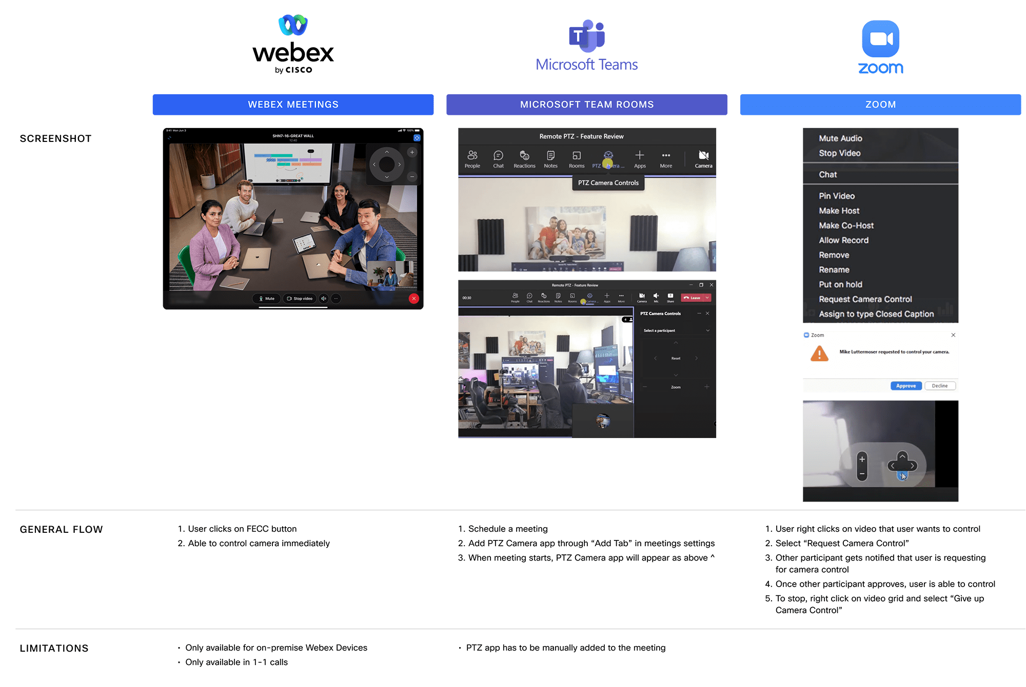
Since Webex Meetings, a different Webex product, had a similar feature with a similar use case, I reached out to the product manager on that project and got a better understanding of their design and constraints. Their main use case was for a one-on-one call with one controlled camera, which is much simpler than for Instant Connect with the possibility of multiple cameras being controlled.
A competitive analysis was done with 2 other competitors that had a similar feature, taking note specifically of their end-to-end user flows on how a user would enable a camera and any other constraints.
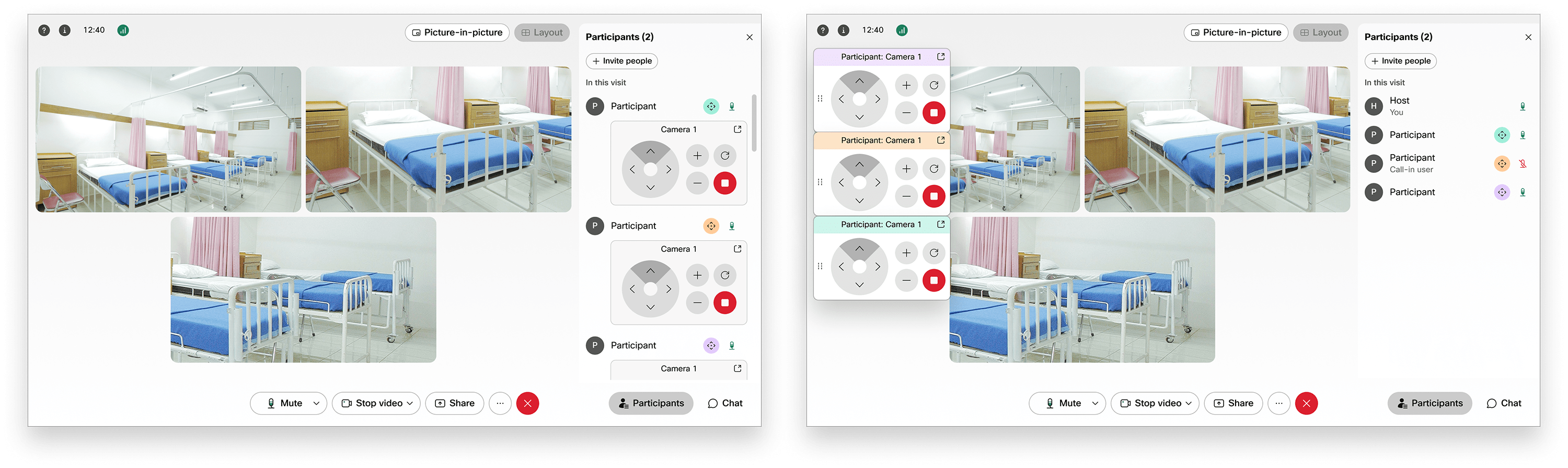
Since Instant Connect telehealth visits can include multiple participants or devices with pan-tilt-zoom capabilities, engineers noted that technically all of them could be controlled simultaneously, which could make things complicated and confusing for users.
In working with the product manager on this project, we identified and narrowed it down to 2 main use cases that we needed to solve for:
We also talked about some assumptions around these use cases:
Afterwards I laid out user flows for the main use case. These were revised as we talked to engineers and the product manager about technical constraints and what made sense for both provider and patient.
There were a few design challenges that I focused on during my explorations. Some things that I kept in mind from a user experience perspective were:
First I explored some different options and user flows for our primary use case, which is a one-on-one visit. Then I explored how might that be translated into an ER situation with multiple cameras.
Due to circumstances during this project, engineers were unable to give us all the technical constraints before the project began, which made things challenging. I continued to iterate my designs based on new constraints that surfaced during design reviews.
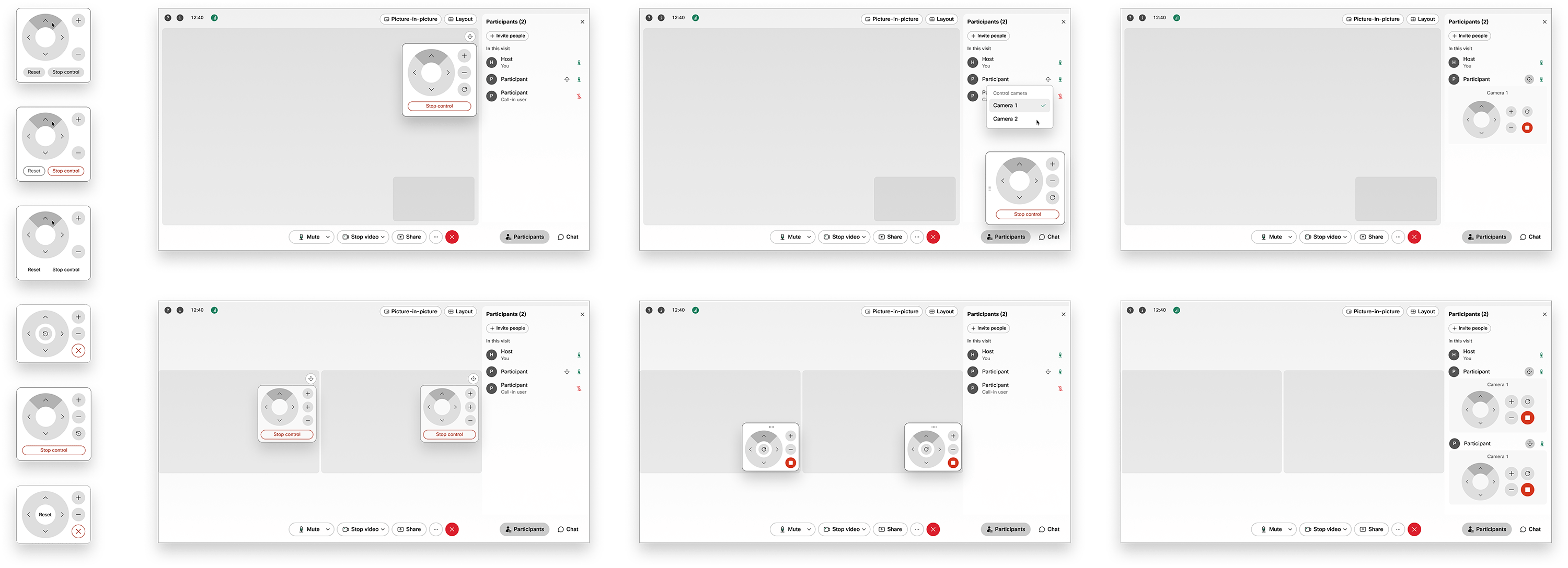
One of the main constraints was that the video view, whether it’s one or multiple participants, is one single video stream. Therefore letting users know which camera control panel was associated with which participant’s video was a challenge.
After understanding the use cases and technical constraints, I explored some more options and landed on a final design that solved for the key design challenges.
VISUAL INDICATORS
In order for providers to know which patient’s camera can be enabled or is enabled, a camera control button will show for each camera that can be controlled. If it was enabled by the provider, the button will turn into a colored state.
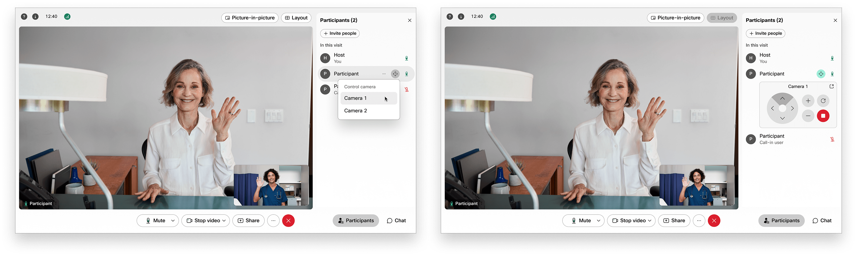
PANEL FLEXIBILITY
In order for providers to see their patients at all times, users are able to pop out the camera control panel from the participant’s panel and use it when the participant’s panel is closed so they can see the patient in a larger video view.
I adjusted the size of the control panel to find the right balance between being unobtrusive and functional. I also made the panel draggable for providers to adjust its position according to the situation.
ELIMINATING CONFUSION
Instant Connect currently had a big UX issue that needed to be fixed. All the participants’ names are named the same, therefore causing other usability issues around identifying a specific participant. This UX fix was currently in the backlog, so I had to work around this issue.
For multiple cameras, in order for providers to determine which control panel is associated with which participant, I contained the camera control panels underneath their respective participant’s name in the participant's panel. However, it could get confusing if all cameras are popped out and can be dragged in different positions. I resolved this by assigning a color to each panel bar and button for each participant to help users associate.
While tackling the different challenges of this feature, I learned how important it is to nail down specific use cases and problem solve around major technical constraints.
Because of the quick timeline of this project, we were unable to clear up any assumptions that we made. Next steps would be to clear up those assumptions with users and perform user testing on main user flows to discover any usability issues.