PROJECT: WEBSITE | BRANDING
ROLE: UX/UI DESIGNER
CHALLENGE
Exploring Music is an independent musical instrument retailer and lessons provider for both Chinese and Western music. Their website is currently outdated and not responsive. Their inventory of instruments for rent and purchase is unavailable to view online. As the more tech-savvy, mobile-using generation are beginning to become parents, Exploring Music would benefit from a website redesign that tailors towards online viewers. The goal of the project is to redesign their brand and create a responsive website that meets the needs of customers.
RESULTS
I redesigned their brand and website that meets the needs of potential users and gears towards a more intuitive user experience.
SECONDARY RESEARCH
I began the project by conducting a market analysis to get a better understanding of the music school market and the demographics of parents who enroll their children in music schools.
INSIGHTS
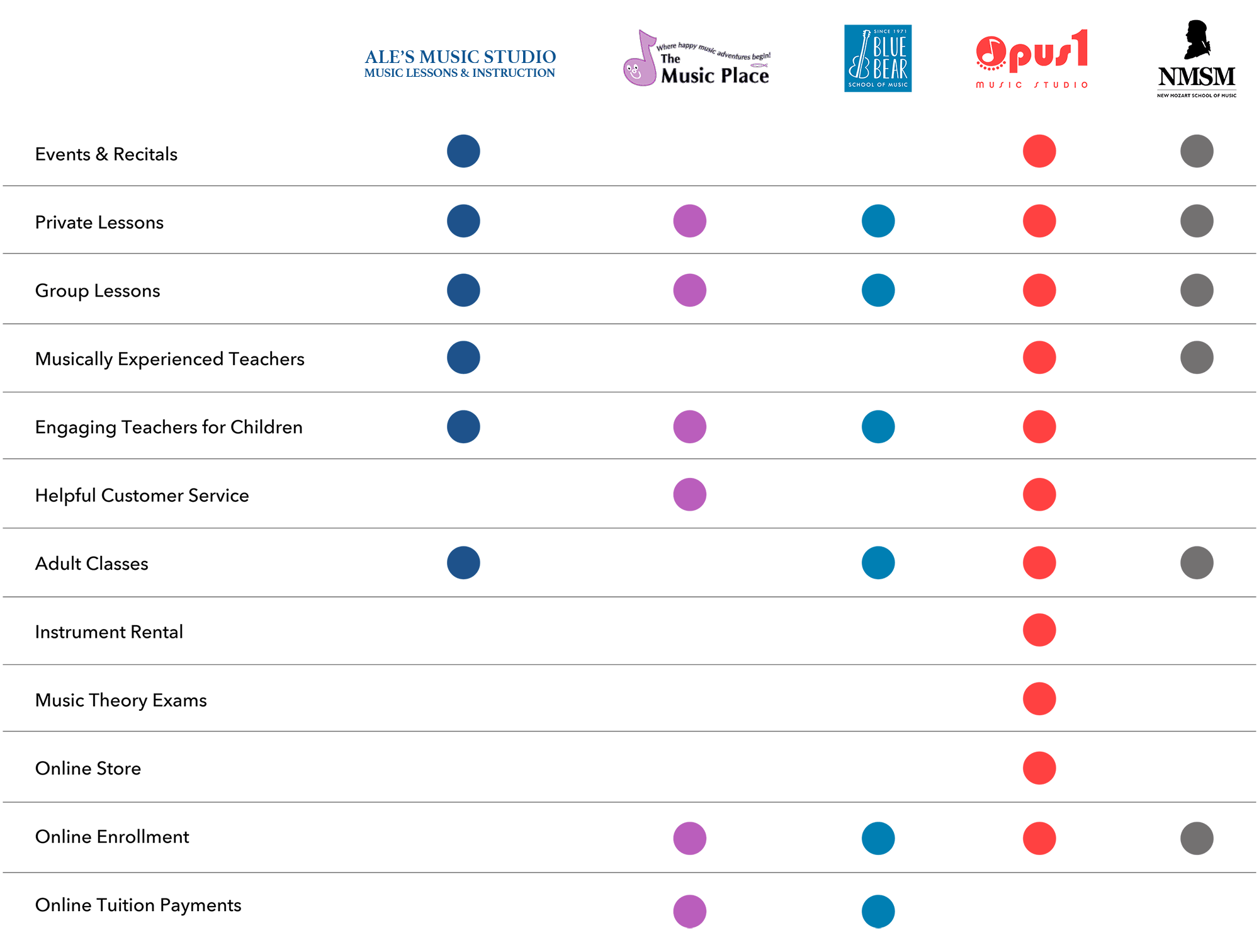
I did a competitive analysis and researched music schools in similar locations and identified features they have and don't have. This gave insight on opportunities where Exploring Music can differentiate or improve on.
ASSUMPTIONS
From the research, there were a few assumptions I gathered about parents and their experience with music schools.
PRIMARY RESEARCH
USER INTERVIEWS
I developed an interview script and conducted interviews with 6 people from ages 35-42 with children ages 3-8. 5/6 of participants have experience with music schools. The goal was to identify any pain points participants had and to validated or invalidate any assumptions.
EMPATHY MAP
Based on the interviews, I gathered all my notes and grouped them into categories to create an empathy map. From there I was able to see any patterns or trends that emerged. As a result, I was able to discover common insights and needs from the participants.
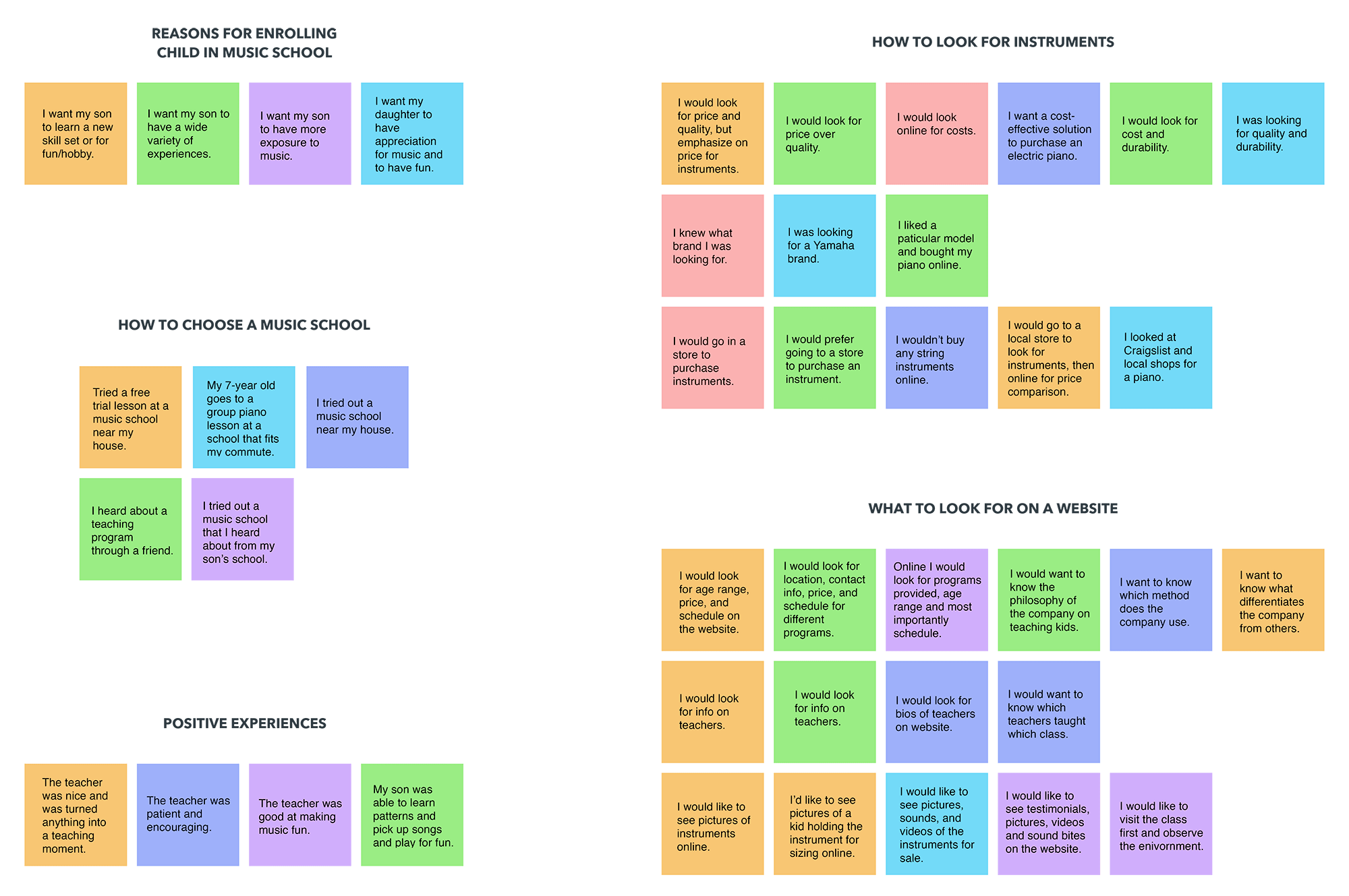
INSIGHTS
NEEDS
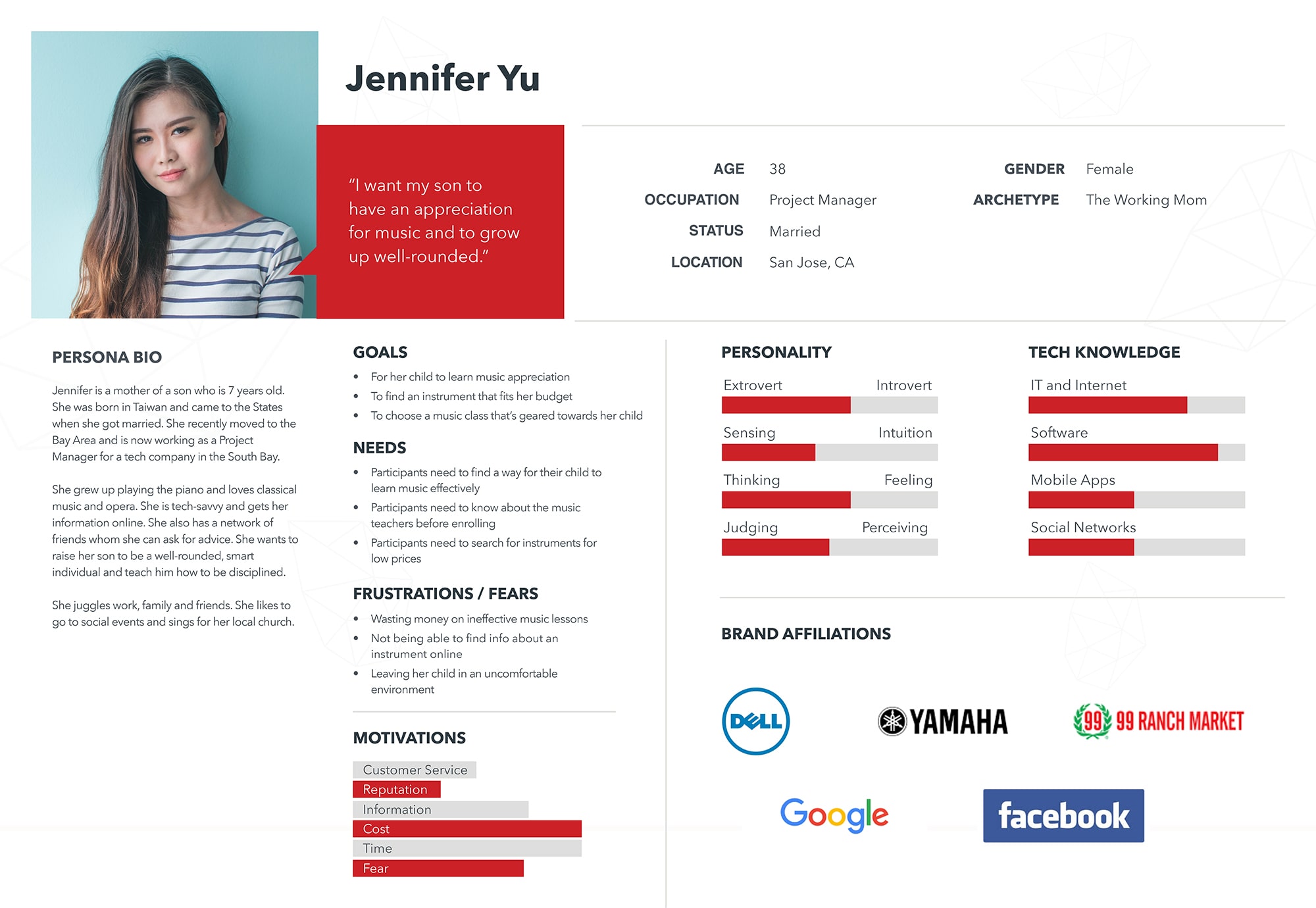
PERSONA
From the empathy map results, a persona was developed to represent the ideal customer along with their goals and needs. My persona is a working mother who is looking for a music school for her son.
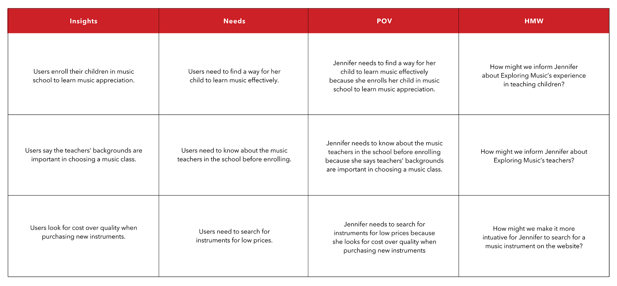
POV & HMW
From the insights and needs extracted from the empathy map, I wrote statements that state our persona's needs from their perspective. From those, I developed How Might We questions to address the problems we're trying to solve.
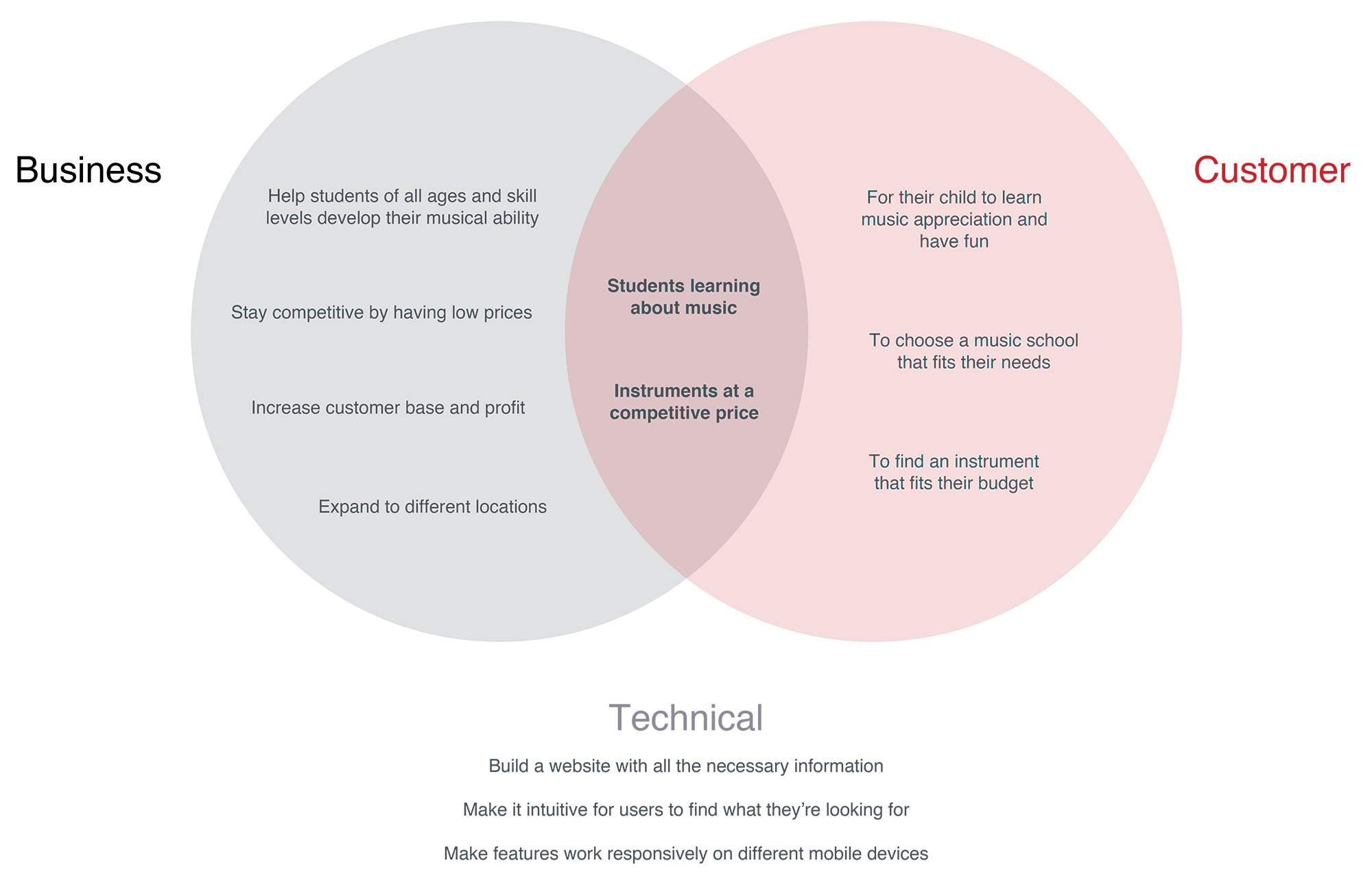
PROJECT GOALS
I then created a diagram showing the business goals and user goals and where they intersect. This allowed me to prioritize on goals for our project.
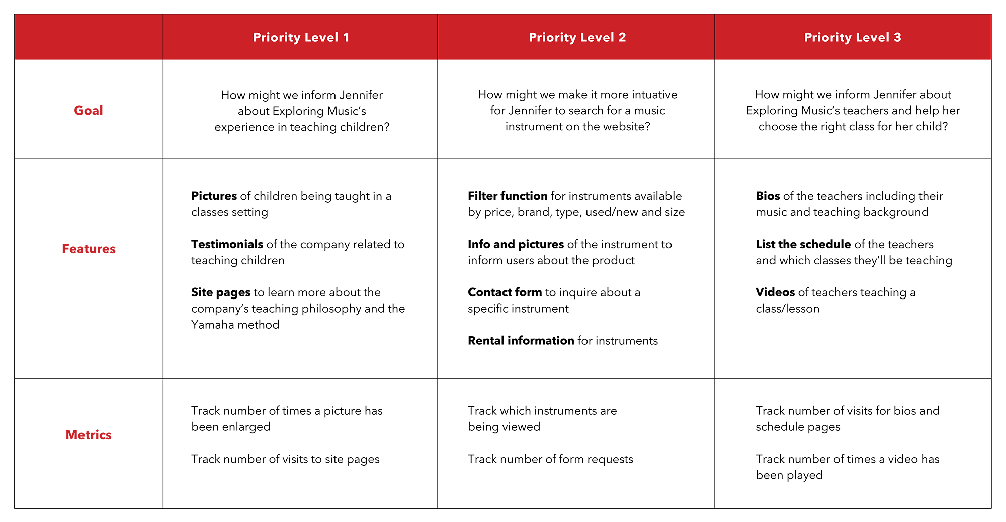
PRODUCT ROADMAP
Since I now know where the business goals and user goals intersect, it allowed me to prioritize what website features are necessary to design.
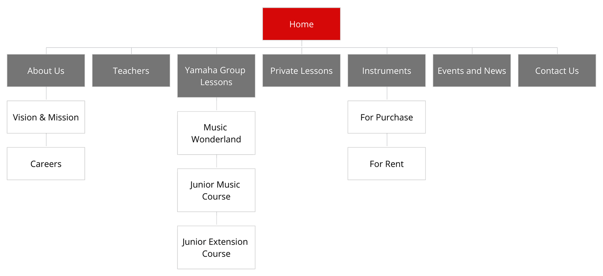
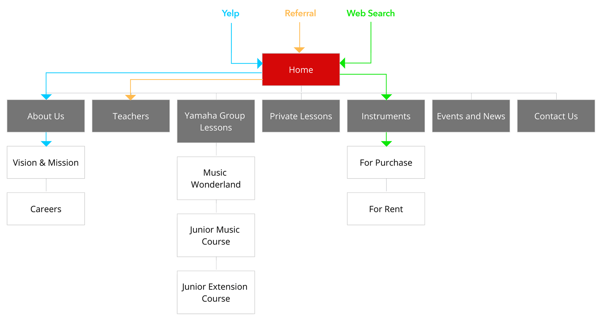
SITE MAP
I created a site map that showed the structure and hierarchy of the website. The goal was to make the website navigation as intuitive as possible for users to navigate through.
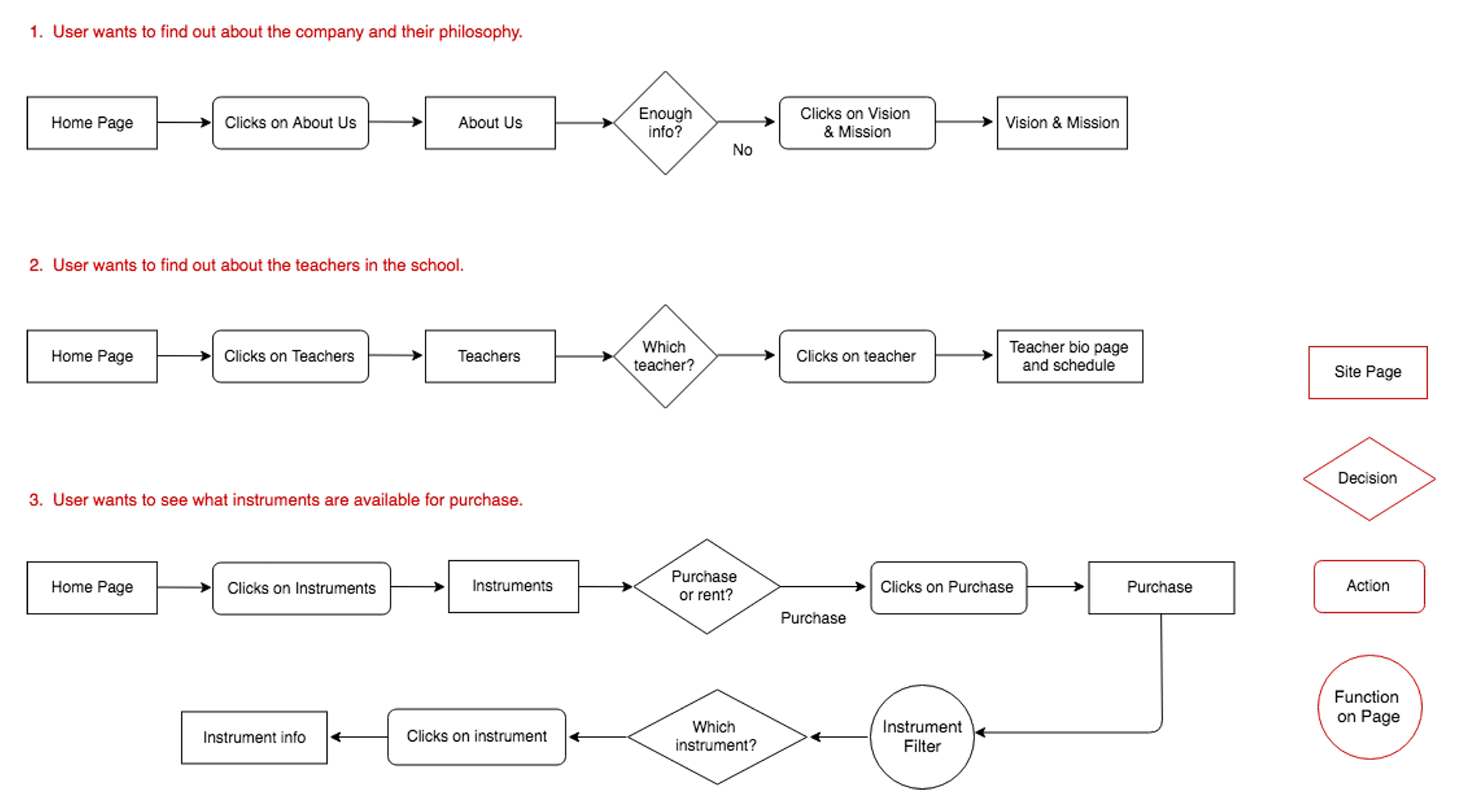
USER FLOWS
From the site map I created, I drew out 3 different user flows to envision different paths a user might take within the site. These user flows would then help prioritize what to prototype and test.
TASK FLOWS
From each user flow, task flows were drawn out to highlight additional actions and tasks.
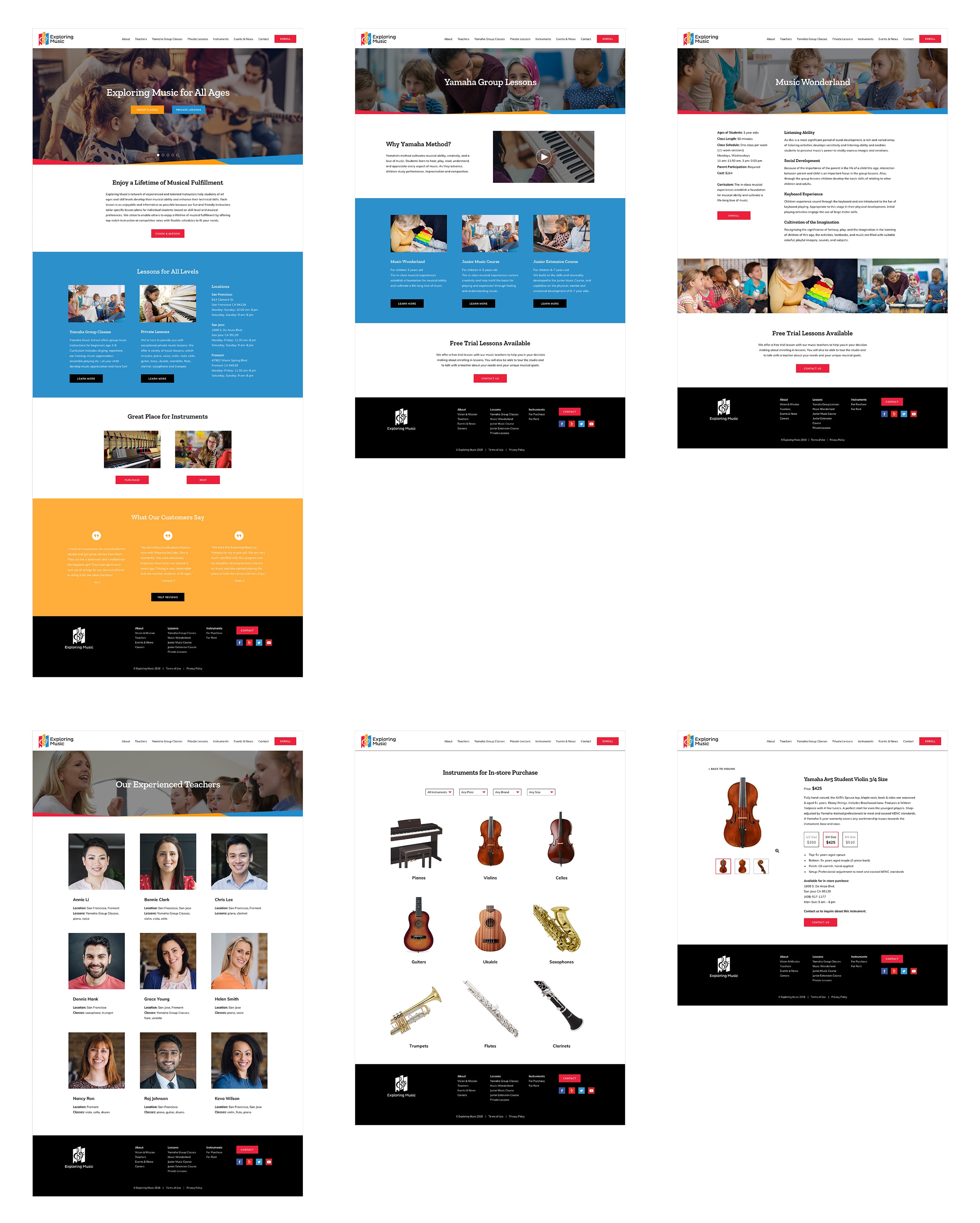
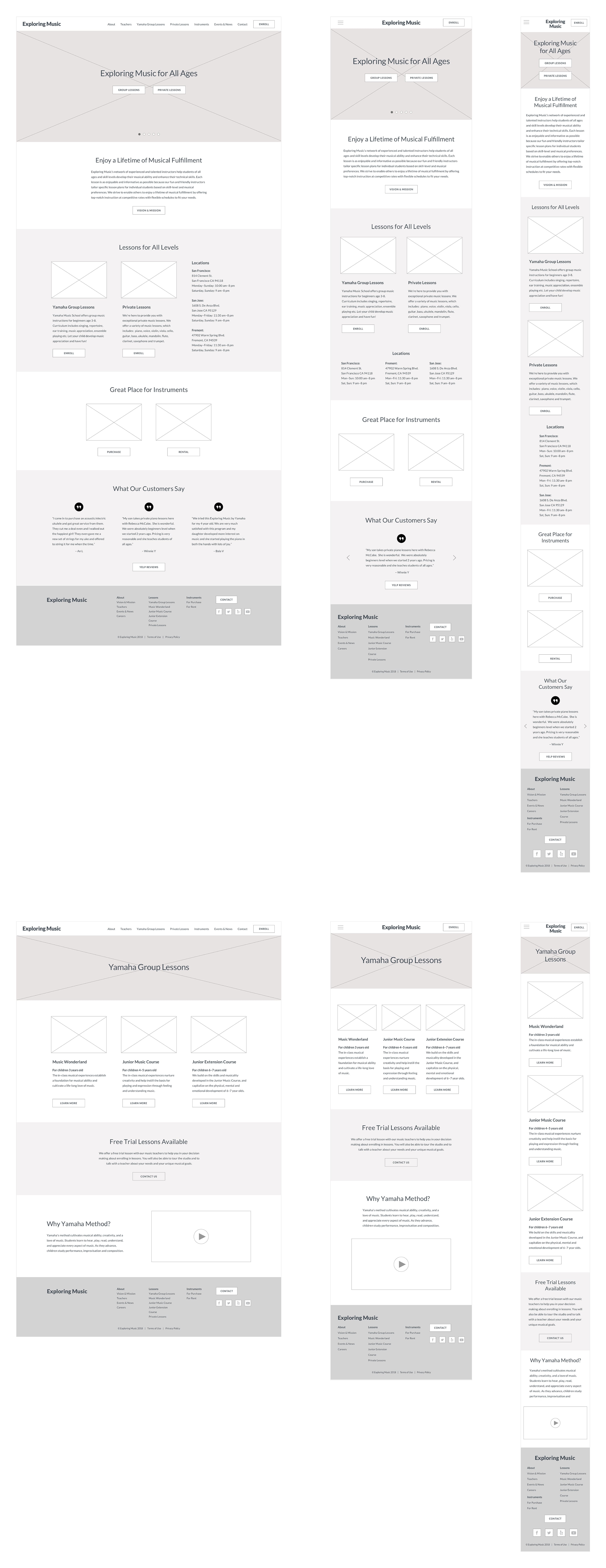
MID-FIDELITY WIREFRAMES & PROTOTYPE
Since our goal is to create a responsive website, wireframes were created for different devices. Then key screens for a prototype were wireframed based on my feature prioritization list and user flows.
USABILITY TESTING
I conducted usability testing to test the overall flow of the website and gather feedback on any frustrations or confusion. I tested 4 participants and presented 4 scenarios and tasks. I observed them as they completed the tasks and had them walk me through their process and thoughts.
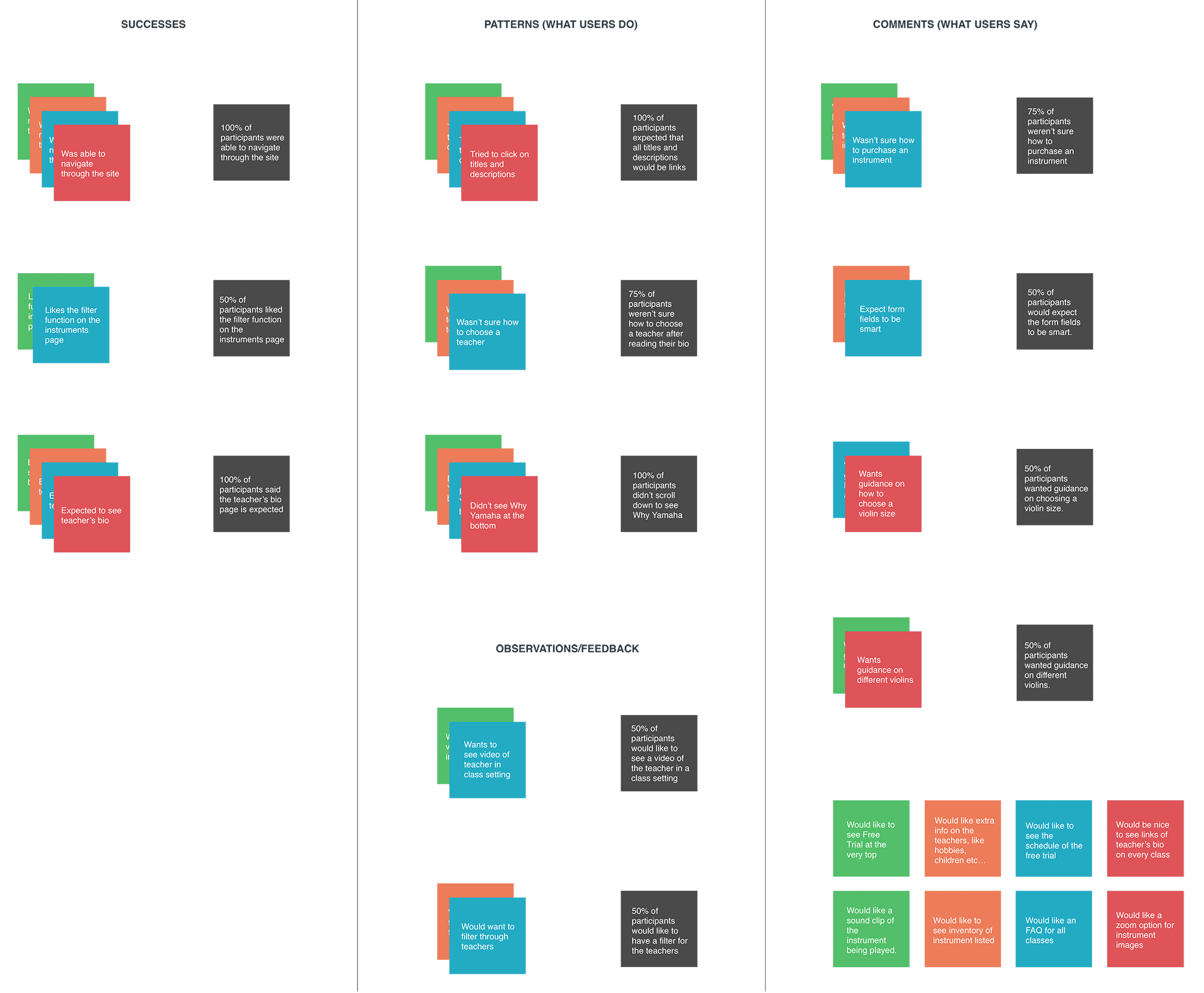
AFFINITY MAP
After testing, I gathered all the notes and broke them down into different categories. The data was then used to find any patterns or trends to discover insights on needs or frustrations users had. Then I made a priority list of improvements for iteration.
PRIORITY REVISIONS
Based on the data from the affinity map, I updated the prototype accordingly.
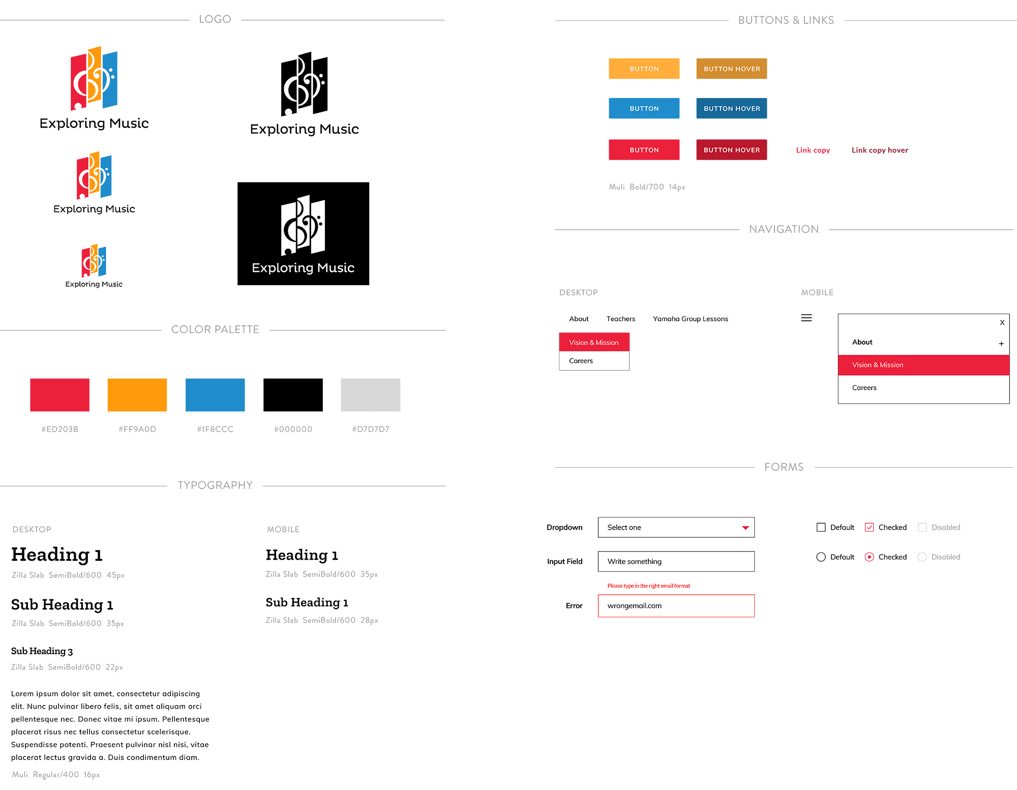
BRANDING & UI Kit
I explored different logo concepts to convey certain attributes of the company. After a logo was finalized, I designed a brand style tile with color, typography and image choices and a UI Kit for web development purposes.
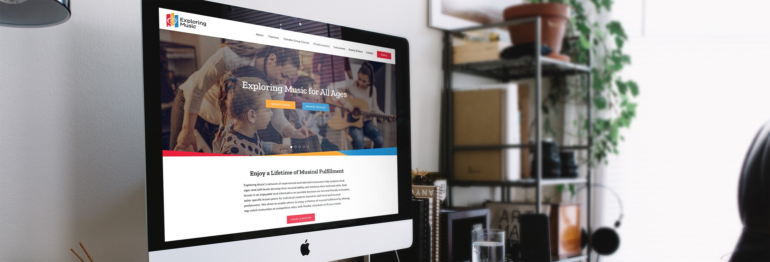
HIGH-FIDELITY PROTOTYPE
I created high-fidelity wireframes for a prototype built in InVision app and implemented my revisions.
Designing a website for a local music school that meets the needs of today's modern-day parents was challenging. Overall the key was to guide the users to their next steps and help them find the information they're looking for. The next steps would be to continue building out more pages and user flows to test. Features to add could include an online enrollment process and an online tuition payment process.