
PROJECT: MOBILE APP | BRANDING
ROLE: UX/UI DESIGNER
CHALLENGE
StockBuddy wants to connect housemates and make it easier to share items and costs within one central app. StockBuddy wants to give a more user-centric approach to their app by adding features and flows that make it delightful for people to use. They want to use the full potential that a mobile app has, such as utilizing the camera to scan barcodes on items or sending notifications to users.
RESULTS
I designed the app and a new brand that resulted in a functional product that simplifies sharing items and splitting bill costs for housemates.
SECONDARY RESEARCH
I began the project by conducting a market analysis to get a better understanding of the demographics of potential users and any industry trends for similar apps.
INSIGHTS
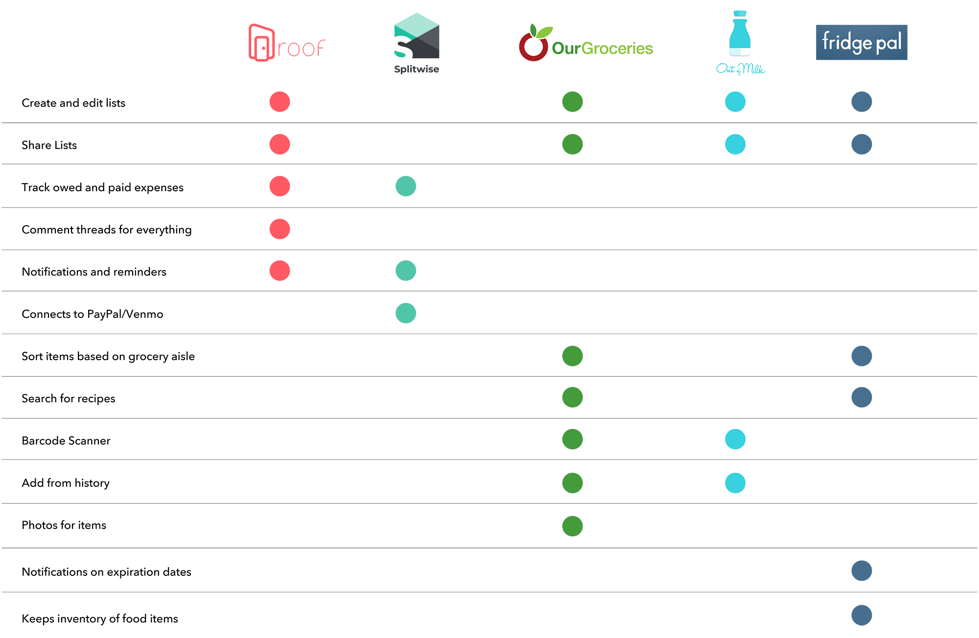
I did a competitive analysis with similar competitors and identified any opportunities where StockBuddy can differentiate.
ASSUMPTIONS
From the research, there were a few assumptions I gathered about how users keep inventory of shared items and split costs.
PRIMARY RESEARCH
USER INTERVIEWS
I developed an interview script and conducted interviews with 4 people from ages 21-38. 3/4 of participants are currently living with housemates and 1 participant has had experience living with housemates. The goal was to identify any pain points participants had and to validated or invalidate any assumptions.
EMPATHY MAP
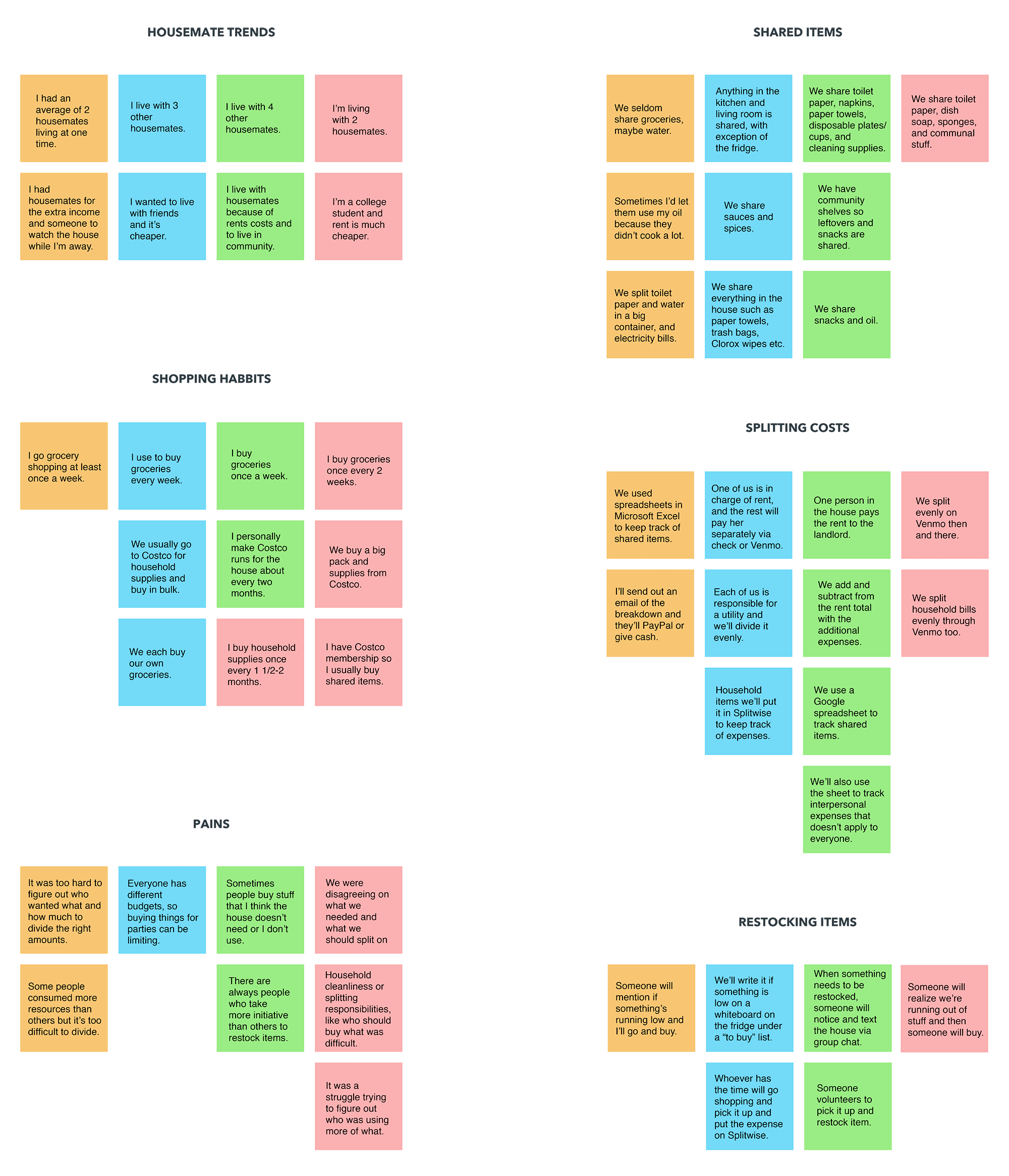
Based on the interviews, I gathered all my notes and grouped them into categories to create an empathy map. From there I was able to see any patterns or trends that emerged. As a result, I was able to discover common insights and needs from the participants.
INSIGHTS
NEEDS
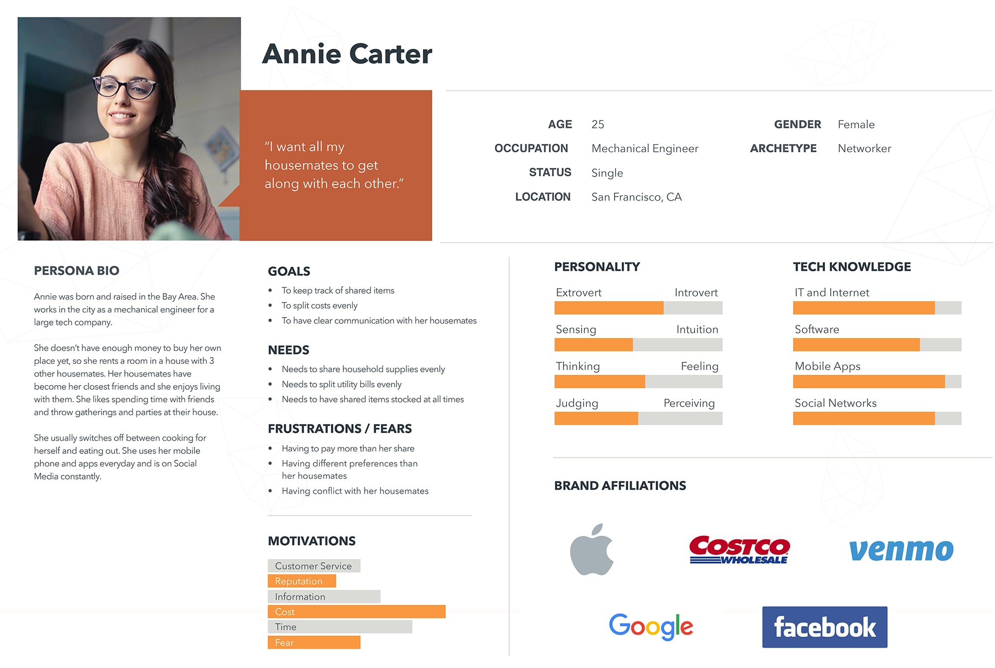
PERSONA
From the empathy map results, a persona was developed to represent the ideal customer along with their goals and needs. My persona is a young adult living in the city who lives with 3 other housemates to save money on rent.
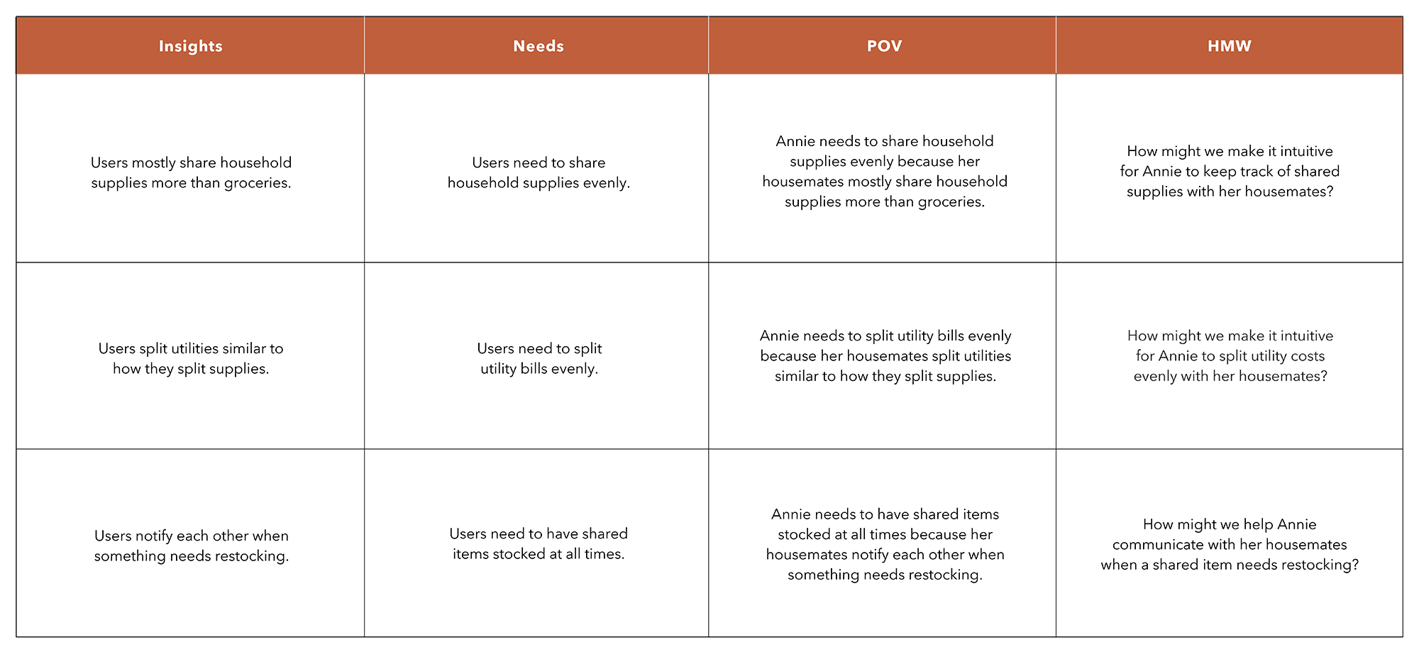
POV & HMW
From the insights and needs extracted from the empathy map, I wrote statements that state our persona's needs from their perspective. From those, I developed How Might We questions to address the problems we're trying to solve.
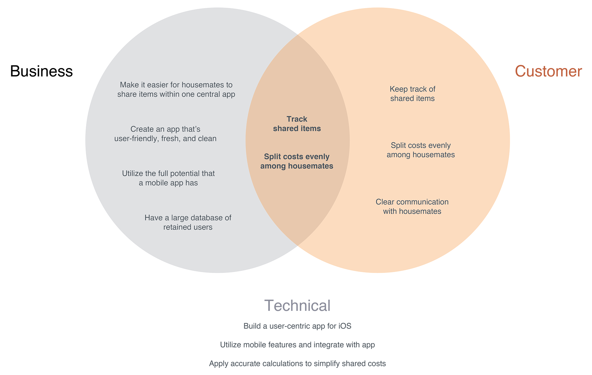
PROJECT GOALS
I then created a diagram showing the business goals and user goals and where they intersect. This allowed me to prioritize on goals for our project.
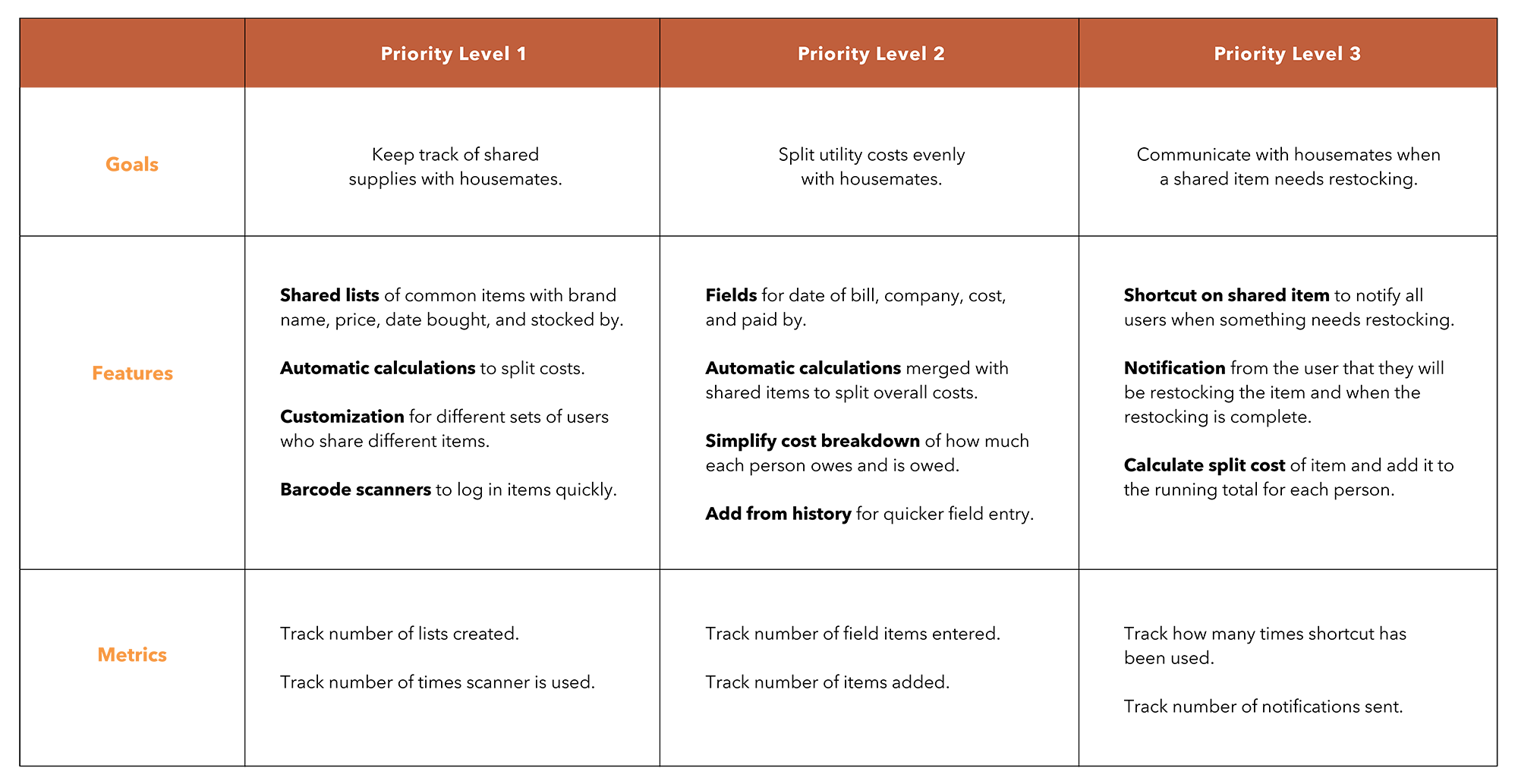
PRODUCT ROADMAP
Since I now know where the business goals and user goals intersect, it allowed me to prioritize what website features are necessary to design.
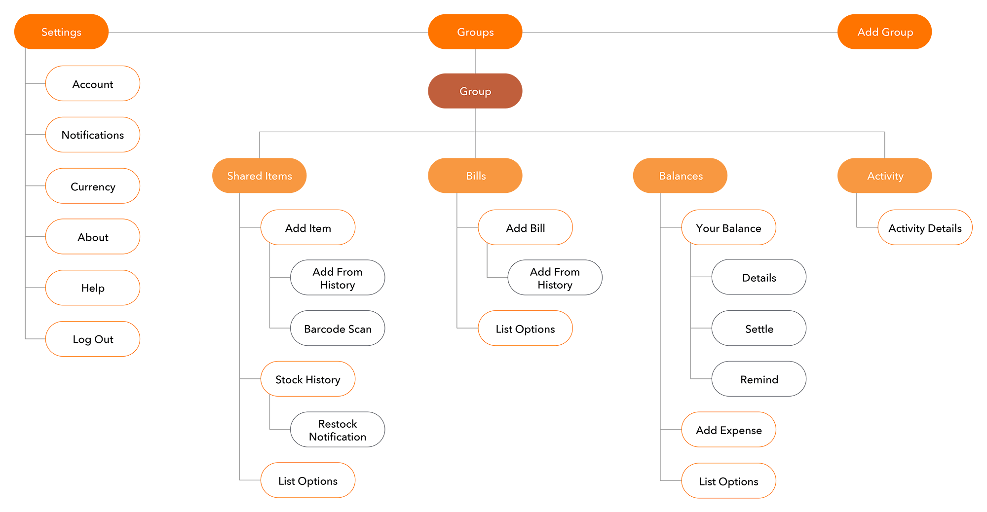
SITE MAP
I created a site map that showed the structure and hierarchy of the app. The goal was to make the app navigation as intuitive as possible for users to navigate through.
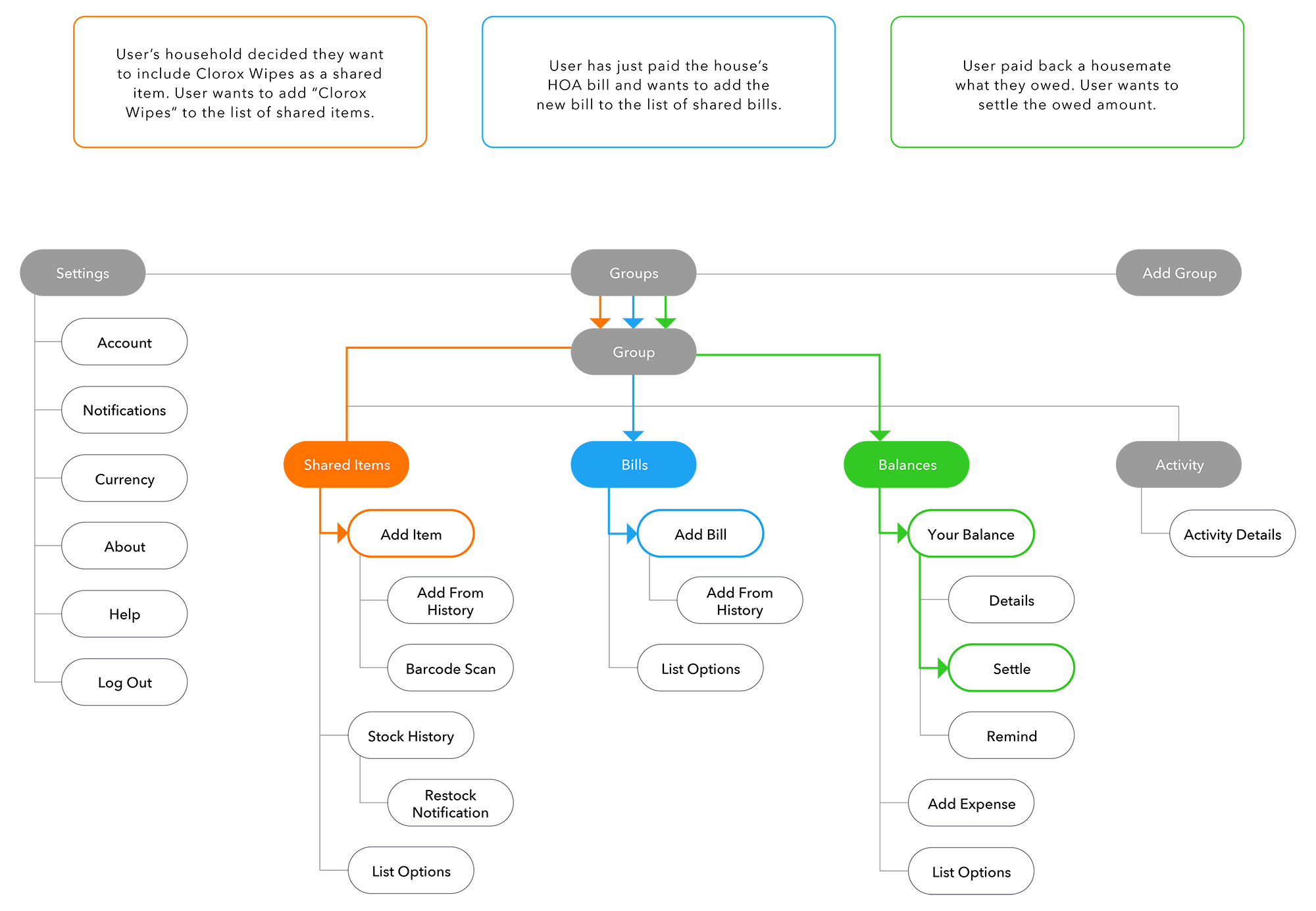
USER FLOWS
From the site map I created, I drew out 3 different user flows to envision different paths a user might take within the app. These user flows would then help prioritize what to prototype and test.
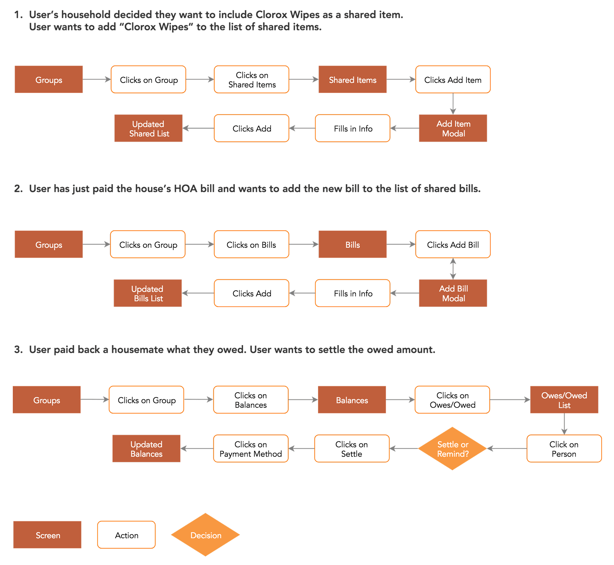
TASK FLOWS
From each user flow, task flows were drawn out to highlight additional actions and tasks.
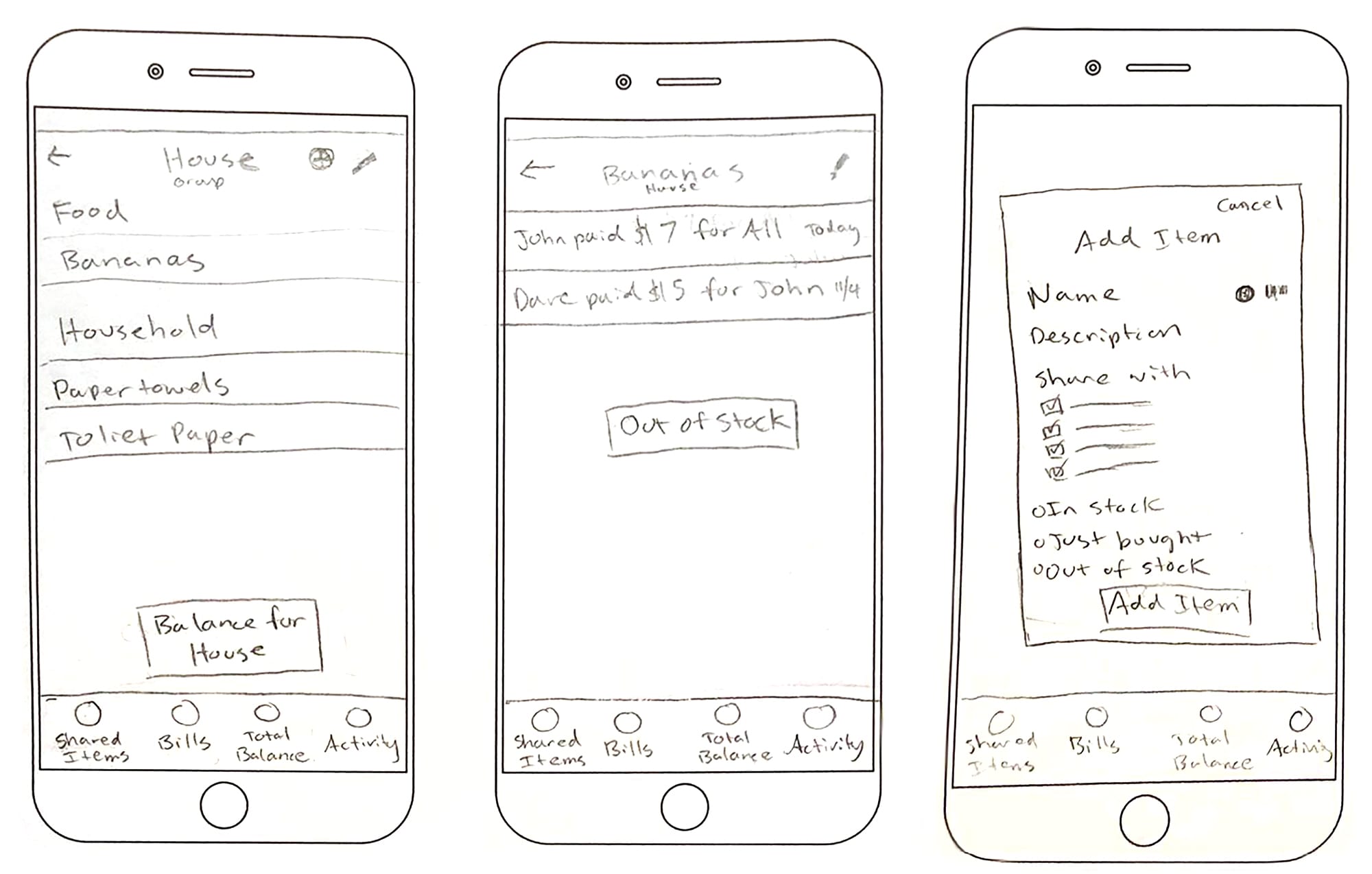
SKETCHES
Using the features laid out in the product roadmap, user flows and task flows, I sketched out some ideas for key screens of the different flows I wanted to test later on.
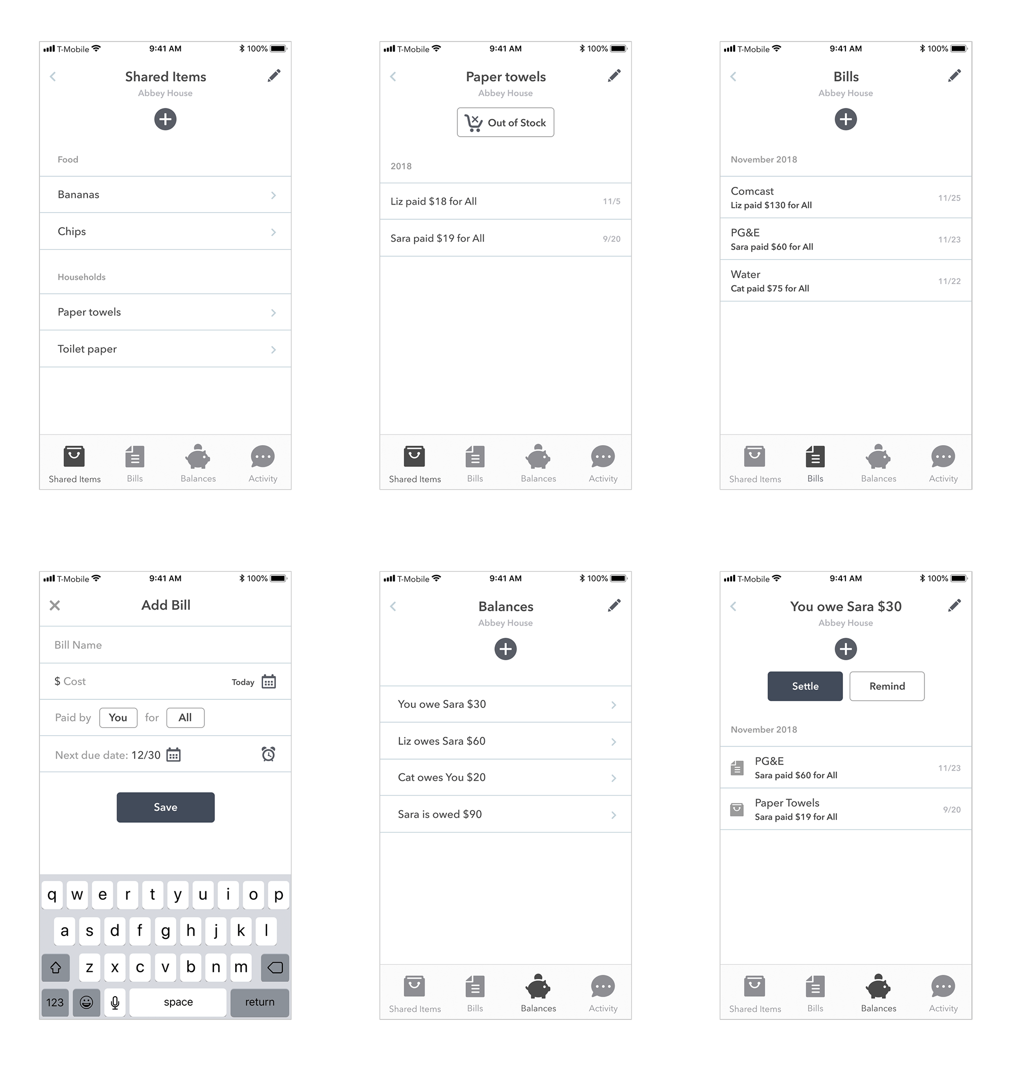
MID-FIDELITY WIREFRAMES & PROTOTYPE
Mid-fidelity wireframes were created based on my feature prioritization list, user flows and sketches. Afterwards I built a prototype for testing in Marvel prototyping app.
USABILITY TESTING
I conducted usability testing to test the overall flow of the app and gather feedback on any frustrations or confusion. I tested 3 participants and presented 4 scenarios and tasks. I observed them as they completed the tasks and had them walk me through their process and thoughts.
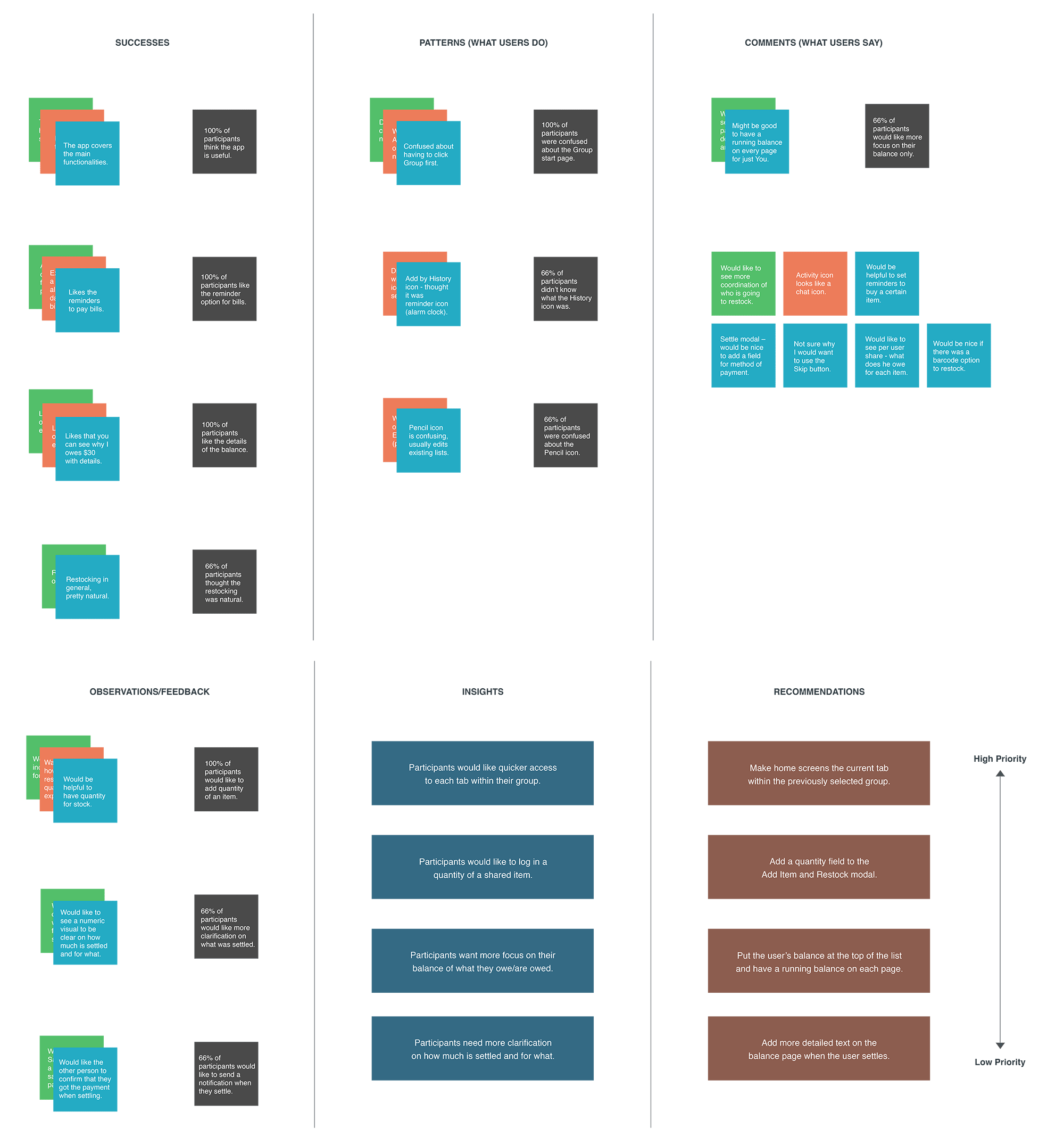
AFFINITY MAP
After testing, I gathered all the notes and broke them down into different categories. The data was then used to find any patterns or trends to discover insights on needs or frustrations users had. Then I made a priority list of improvements for iteration.
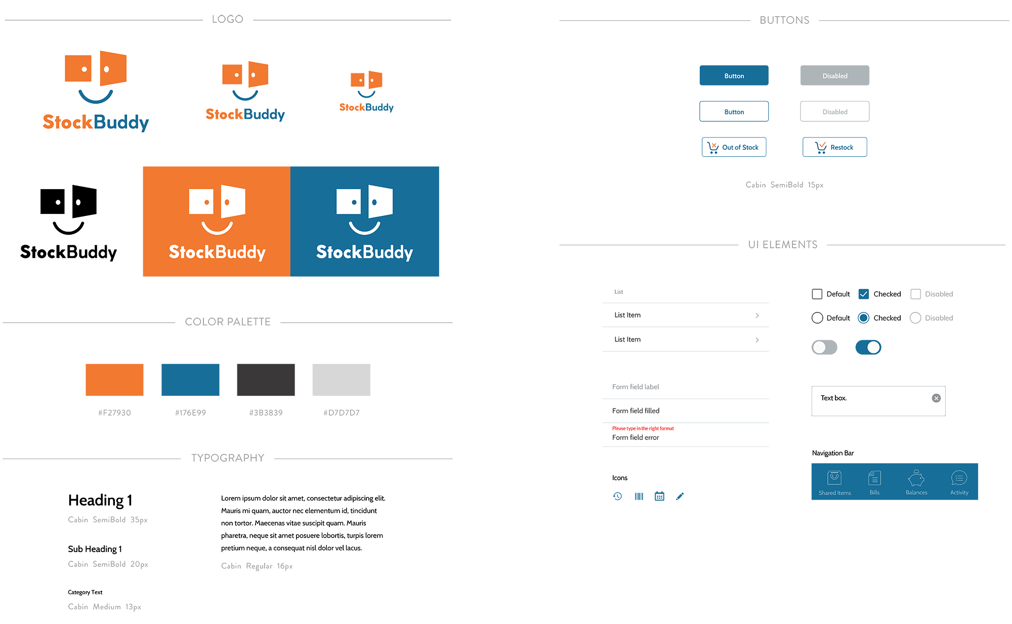
BRANDING & UI Kit
I explored different logo concepts to convey certain attributes of the company. After a logo was finalized, I designed a brand style tile with color, typography and imagery and a UI Kit for web development purposes.
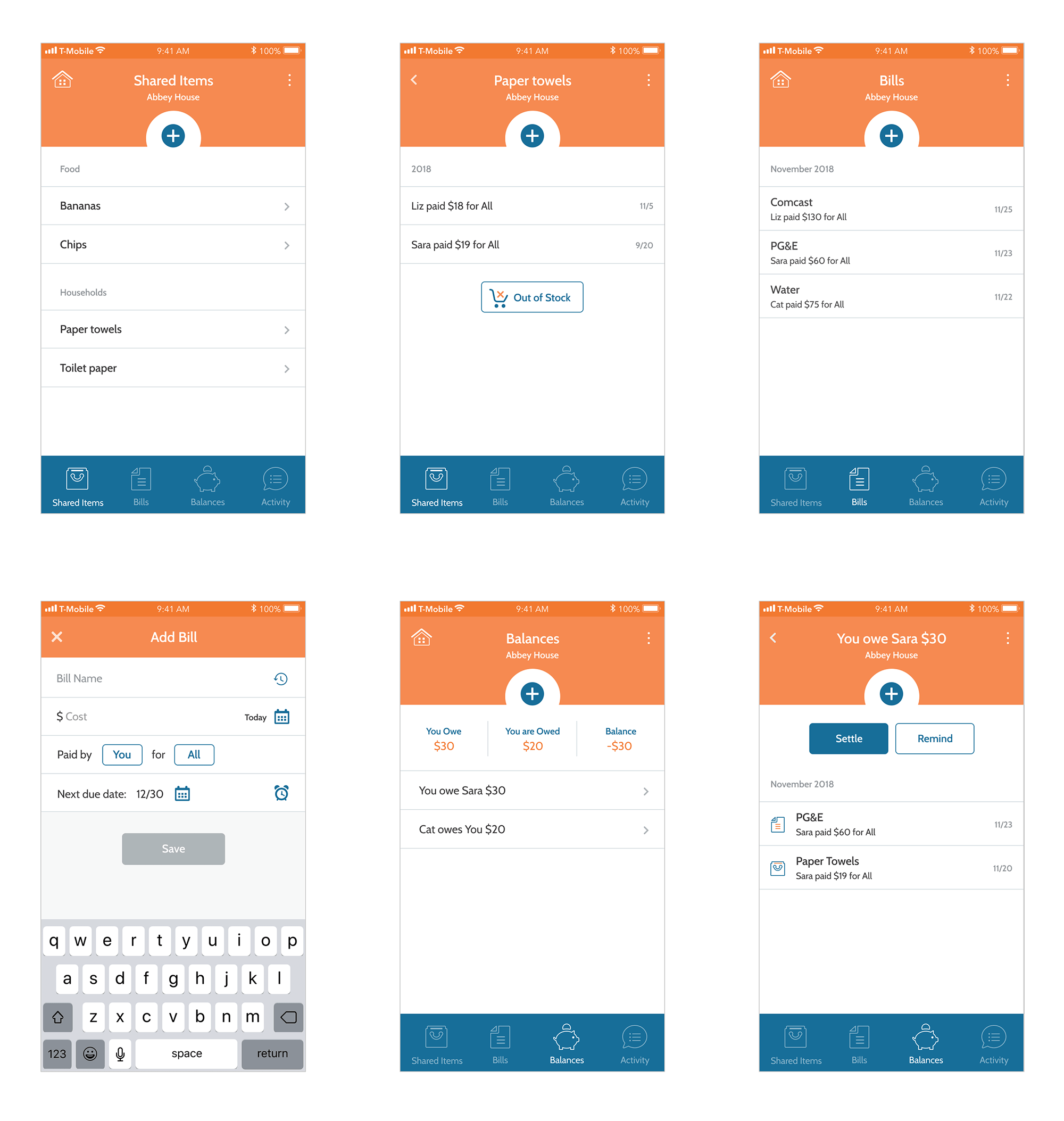
HIGH-FIDELITY PROTOTYPE
Based on the branding I designed, I created high-fidelity wireframes and built out a prototype that includes the priority changes from the affinity map.
Designing an app from scratch was definitely enjoyable and challenging at the same time. Since it's a new product idea, my primary research and discovery of what users need helped drive the direction of the app. My next steps would be to build out the rest of the app and conduct more user testing to refine current features or build new ones.